| > Show on single page > Show on multiple pages |
After completing the analysis of a new version of your project, you will probably want to investigate how it has evolved, more specifically for which artefacts the quality has decreased. Let's look at the current version of the Earth Project (which should be available if your Squore administrator has created the sample projects shipped with the Squore installation) to find out how to spot the worst-scored components in your project.
Log into Squore as the demo user using demo/demo
and observe the evolution of the Earth project in the
Project Portfolios:
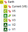
The versions of the Earth Project
The downward arrow before the project name in the the Project Portfolios indicate that the quality of the last version decreased. By expanding the Earth project to show the version history, you learn that the quality of the current version decreased compared to V5, which itself was worse than V4. (More information about the quality indicator icons is available in the section called “Where Are My Analysis Results?”.)
You can start evaluating the version by looking at the score card, which rates Earth at D. Some values under Artefact Counting, Line Counting and Rule Checking explain the lower score: the application contains more files and functions, more lines of code, less comments and more rules violations.
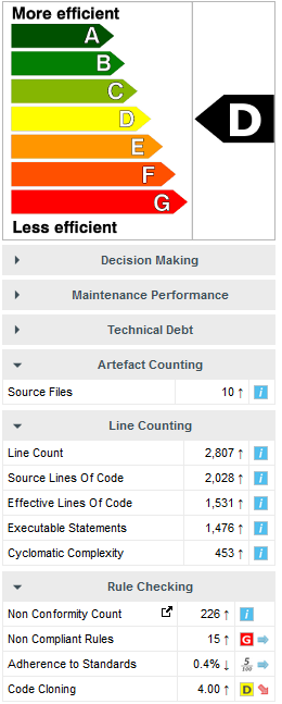
The score card for the current version of Earth
By now you probably want to find out which components in your project are responsible
for lowering the score of the application in this version. If you want the Artefact Tree to
reflect this information, you can change the sort order to show the worst scores first
by clicking on the sort icon
( )
and selecting
LEVEL > Worst first to display artefacts from worst-scored to
best-scored.
)
and selecting
LEVEL > Worst first to display artefacts from worst-scored to
best-scored.
The Function Maintainability Level chart is a good place to begin to understand how bad some of the components in your project are affecting the overall score.

The Function Maintainability Level chart
From the chart above, you can read that 4% of all functions are rated E or F. It is a good idea to go look for these functions in the Artefact Tree and see what is wrong with them. There are several ways to do this: via filtering and Searching, or using the Highlights feature.
In this section, you will learn to look for artefacts the hard way by using filters and search. For a more automated way to find artefact that fit a specific category, take a look at the section called “Finding Artefacts Using Highlights”.
Click the Filter icon
( )
above the Artefact Tree to show the filter options and select only the levels E and F:
)
above the Artefact Tree to show the filter options and select only the levels E and F:
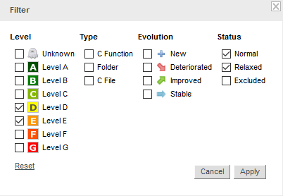
The filter popup with the boxes checked to filter artefacts rated E or F
Click Apply to apply the changes, and the Artefact Tree should refresh to show only artefacts in the levels selected, as shown below:
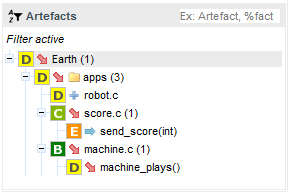
The filtered Artefact Tree showing artefacts rated E or F
The notice Filter active is always displayed above the Artefact Tree when you are using a filter. The tree now only shows artefacts rated E or F, along with their ancestors (i.e. their parents and their parents' parents), even though the ancestors may not be rated E or F.
While a filter is active, you can still search for other artefacts by typing a search term in the search box. Try typing ma in the search box above the Artefact Tree, and watch the search results list get populated as you type:
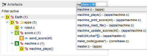
The search results for the term entered in the search box
If you select the first search result in the list above,
you will open the dashboard for machine.c.
Let's go back to our filtered tree. The filter singled out two artefacts with the
required score range: machine_plays() and
send_score(int). The function machine_plays() deteriorated in
version 6. Click on the function machine_plays() to view its
dashboard. Note how the score card indicates that the cyclomatic complexity,
non-conformity count and non-compliance to rules have all gone up.
Now click on the Control Flow Chart, to see the function's complexity.
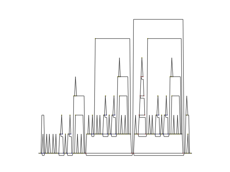
The Control Flow Chart for machine_plays()
The Control Flow Chart is a graphical representation of the way the code of a function can be executed. The line representing the entry into the function starts on the left and branches every time it reaches a logical operator, represented on the chart as described below:
Gray circle: If, End If
Blue circle: While, End While, Do, End Do and GOTO
Red circle: For, Foreach, End For, End Foreach and Return
Pink circle: Switch, End switch, Try, End Try, Catch, End Catch, Finally, End Finally
Green circle: Break, Continue
Yellow rectangle: Statement
More importantly, you can compare this version's Control Flow chart with the one generated for the previous analysis of the Earth project. Click on V5 in the the Project Portfolios and watch the dashboard refresh to show the analysis results for version 5. Observe how much simpler the control graph is for this version:
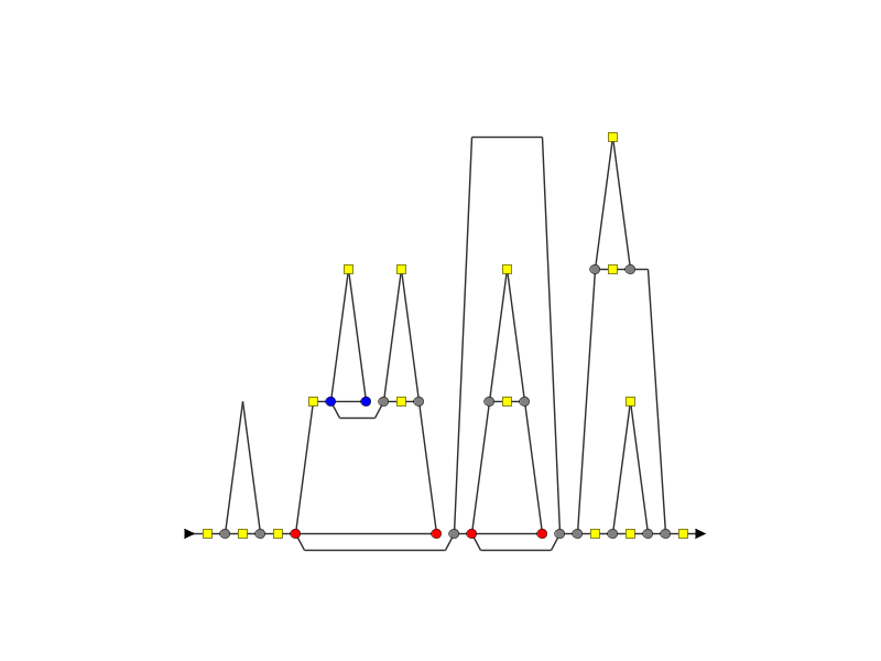
The Control Flow graph for version 5 of machine_plays()
Another convenient way to try and find why a project's quality is deteriorating is to filter on the evolution of an artefact.
Select the current version of Earth again and edit the active filter: Uncheck the boxes for levels E and F, and select
the Deteriorated category in the Evolution column.
When applying the filter, you should see the artefacts in the tree
that have the  icon
next to their name.
icon
next to their name.
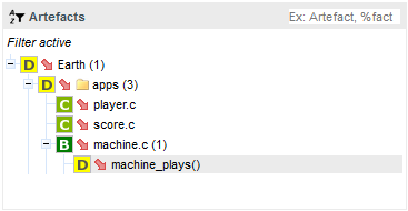
The artefacts that deteriorated in the current version of Earth
The functions you looked at earlier are still here, but there are more deteriorated artefacts
that you can start reviewing. If you click on
player.c for example, which is rated C.
In order to find out where the degradation took place, you can look at the indicators tree to understand where the decline in quality comes from. Expand all the nodes in the indicators tree to reveal the issues with the artefact:
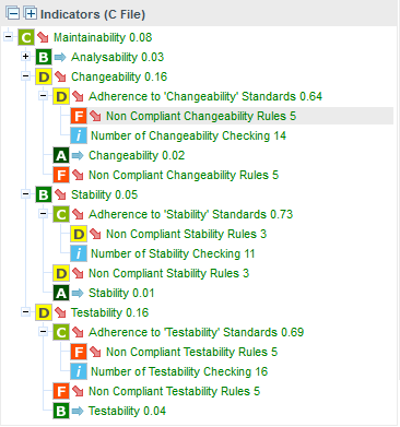
The Indicator Tree for player.c
Squore makes it easy to spot the irregularities quickly, like the fact that the Non Compliant Changeability Rules causes many of the indicators to get a worse score in the latest version than before. This is probably the first item to review in this function.
Take a look at the Rule Checking section of the artefact's scorecard to confirm the results:
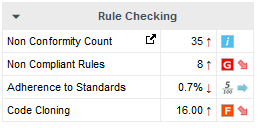
The scorecard for player.c
By clicking the link icon, you can directly view the violations for this artefact in the Findings tab.
You can dive further into the analysis results by looking at the information contained in other tabs and assign action items to your team by referring to Chapter 6, Managing Your To-Do List With Squore or report your progress as explained in Chapter 9, Communicating With Squore.
In the previous section (the section called “Finding Artefacts Using Filters and Search”), you got familiar with searching and filtering to find the artefact that have a negative impact on the overall rating of a project. in this section, you will learn to master the Highlights functionality, which aims to make the process of finding certain categories of artefacts easier.
Highlights are flat lists of artefacts ordered in predefined categories for a model.
Let's try to confirm our findings about the worst and most deteriorated artefacts in Earth. Click on the current version of Earth and clear the filter. Click the Highlights tab of the Explorer and select the Top 10 worst artefacts category. The list appears as shown below:
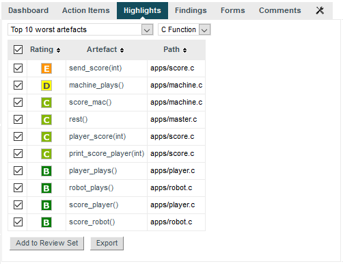
The Top 10 worst artefacts in the current version of Earth
The list confirms that the artefacts with the worst rating are machine_plays() and send_score(int). The Highlights table shows you the artefact rating, name and path, and allows you to go to the artefact's dashboard directly by clicking the artefact name.
Now you can also find the deteriorated artefact player.c that you identified with a filter earlier in the section called “Finding Artefacts Using Filters and Search”: select the Top 10 most deteriorated artefacts highlight category to see the artefact appear in the list of deteriorated artefacts in this version.
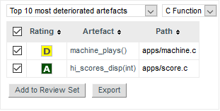
The Top 10 most deteriorated artefacts in the current version of Earth
Artefacts are sorted by degradation, i.e. the difference between the value of the main indicator in the previous baseline version compared to the current value. By clicking the Export button, you can export the selected items to a CSV file. If the Export button is greyed out, your licence does not include the option to export data to CSV files.
By default, the list of most deteriorated artefacts is compiled based on the previous version. By using the Reference list
in the Explorer Settings menu ( )and choosing another reference version, you can update the statistics based on the
new reference version you just selected.
)and choosing another reference version, you can update the statistics based on the
new reference version you just selected.
Note: The notions of baseline and draft versions is explained in the section called “Working with Draft and Baseline Versions”.
The following categories are available for all default models:
Top 10 worst artefacts
Top 10 most deteriorated artefacts
Top 10 most improved artefacts
Top 10 'borderline' artefacts
All new artefacts
All impacted artefacts
Top 10 most changed artefacts
Top 10 worst folders
Top 10 worst functions
Top 10 non-compliant functions
Top 10 functions with non-conformities
Top 10 most complex functions
Squore administrators can customise and expand this list by referring to the Squore Configuration Guide.