| > Show on single page > Show on multiple pages |
Now that you have created a project, you are ready to start reviewing the analysis results in the main section of Squore, the Explorer, which consists of a set of trees for browsing through project artefacts and various dashboards to display the information associated with these artefacts.
The Squore Explorer
Common icons are used throughout the explorer to indicate the rating of a component and its evolution compared to the previous version. The image below shows the meaning of the different icons used:
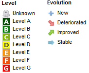
The Squore Explorer icons
The left-hand part of the Explorer is a three-panel section containing expandable trees.
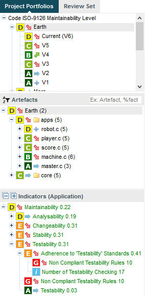
The Tree Pane
The top panel contains the Project Portfolios and the Review Set.
The Project Portfolios is a list of all the projects you have access to, grouped by analysis model. Each project is listed with its latest rating and evolution and can be expanded to show all versions of the project that were analysed with Squore.
The Review Set is a flat list of artefacts you collect from various projects in order to review them. This list is saved when you log out and log into Squore again.
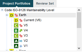
The expanded Earth project, rated D, and its 6 versions in the Project Portfolios
The tree in the middle panel is the Artefact Tree . When Squore analyses a project, it breaks it down into artefacts of various configurable types, for example APPLICATION, PROGRAM, FOLDER, FILE, CLASS or FUNCTION, according to the analysis model used. The artefacts in the tree are displayed for the version selected in the Project Portfolios. clicking a different version of a project refreshes the artefact tree with the ratings for the version just selected. Above the artefact tree are tools for filtering, pinning, sorting and searching artefacts. Each artefact is displayed with its current rating and can be expanded to reveal child artefacts if available. The number in brackets indicates the amount of child artefacts for the current artefact. You will learn about these tools later in the section called “Has the Quality of My Project Decreased Since the Previous Analysis?” and the section called “How Do I Find and Keep Track of Artefacts?”.
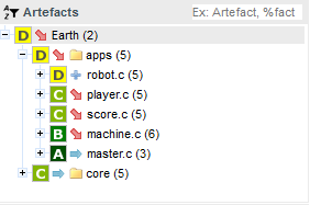
The Artefact Tree for version 6 of the Earth project
The bottom panel is the Indicator Tree , in which ratings for the indicators defined in the analysis model at the current level are displayed. Each indicator can be expanded to display the rating of each of its sub-indicators. The Indicator Tree displays statistics for the artefact currently selected in the Artefact Tree and refreshes when the selection is changed. The type of artefact selected in indicated in brackets. Two shortcut buttons can be found above the top node to quickly expand and collapse the entire tree.
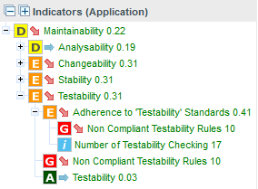
The partly expanded Indicator Tree for version 6 of the Earth project at Application level
Clicking one of the tree nodes reveals more information about the indicator, including the formula used by Squore to compute its value and rating.
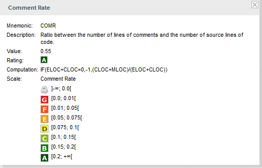
The popup displayed when clicking the Comment Rate indicator for a function
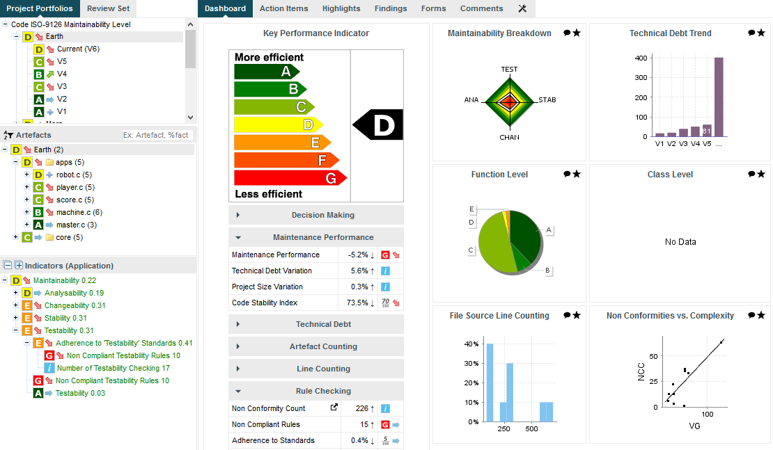
The right-hand side of the Squore Explorer contains a series of tabs, the first of which is the Dashboard. The Dashboard is dynamic and always displays information about the artefact currently selected in the artefact tree. There is not one Dashboard, but a Dashboard per node in the tree. Additionally, the Dashboard can be customised by a Squore administrator so that users see a different Dashboard according to their role in a project, thus highlighting different information for project managers, quality engineers and developers for example. Ask your Squore administrator about Dashboard customisation, or refer to the Squore Configuration Guide for more information.
The left-hand area of the Dashboard contains the score card , which consists of a graphical representation of the key performance indicator for the current artefact, and some tables highlighting key metrics about the project.
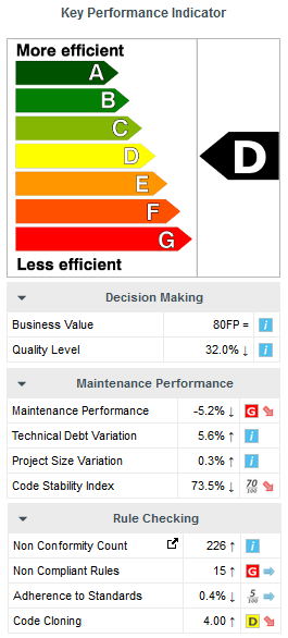
The score card area
Each table lines display a series of details about the key performance indicator:
The name of the metric (e.g. Maintenance Performance). When clicked, a popup shows the way the metric is computed. Optionally, some metrics may allow an extra link to be displayed. This link shows the list of findings taken into account when calculating this metric (See Non Conformity Count).
The raw value of the metric and its evolution according to the previous version (e.g. -5.2% ↓). Clicking a value ion this column displays a chart of the history of the last 10 values recorded for this metric.
If the metric displayed is an indicator, the rating of the indicator is displayed, along with its evolution (e.g. Level G, deteriorated). If the metric is a measure, then an information icon is shown. In both cases, you can click the information in this column to display more details about how the metric is computed.
The right-hand area of the Dashboard contains a series of charts representing key information about the current artefact. Clicking a graph opens a larger version of the image so you can analyse the data. Note that the available charts will differ depending on the type of artefact selected in the tree. Files and functions for example include a Source Code chart (for users who have the privilege to browse source code), which does not appear in the Dashboard for folders and applications.
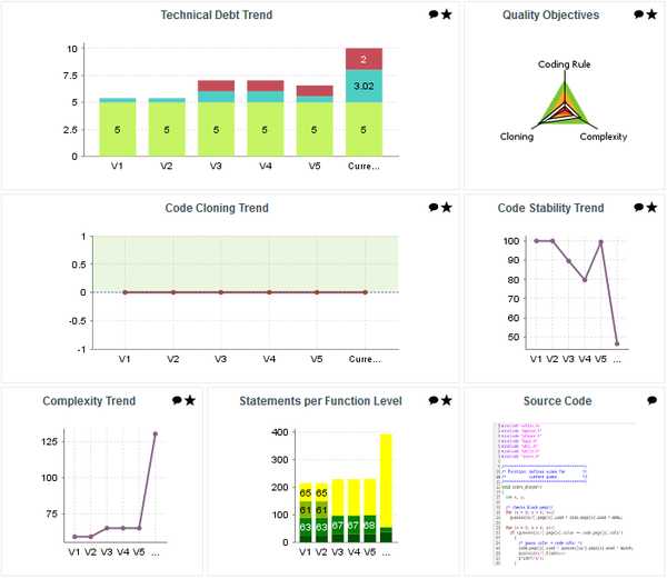
The charts area
The Dashboard is only the first of a series of tabs in the Explorer. In the following chapter, you will find out more about the role of the Action Items, Highlights, Findings, Forms, Reports, Indicators, Measures and Comments tabs. Note however that like the Dashboard, the information displayed in each tab is always relative to the node currently selected in the Artefact Tree.