| > Show on single page > Show on multiple pages |
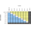
Dashboards for artefacts consist of two areas: the scorecard area and the charts area. When clicking the name of an analysis model instead of an artefact, then a special dashboard is used: the Analysis Model Dashboard.
The Squore Artefact Dashboard Areas
The type of the artefact targeted is specified in the definition of the dashboard. The number of columns used in the graphics area and the default width and height of graphics can optionally be set.
<dashboard type="APPLICATION" nbColumns="3"
  defaultWidthValue="500" defaultHeightValue="500" >
  <scorecard> ... </scorecard>
  <charts> ... </charts>
</dashboard>
The dashboard
element supports the following sub-elements:
The dashboard
element supports the following attributes:
type
(mandatory)
is the type of artefact that this dashboard definition applies to.
nbColumns
(optional, default: 3)
sets the number of columns used to display the charts on the dashboard.
defaultWidthValue
(optional, default: 400)
sets the default width of a maximised chart if not specified within the chart itself.
defaultHeightValue
(optional, default: 400)
sets the default height of a maximised chart if not specified within the chart itself.
factor
(optional, default: 1.5)
is the zoom factor for thumbnails on the dashboard. Factor 1 is equivalent to a thumbnail size of 100 pixels.
template
(optional, default: 1x1 for all charts)
allows changing the aspect ratio of charts in the dashboard, using the syntax "position:width x height;".
Note that the use of this attribute requires defining a value for the nbColumns
attribute.
For more details about dashboard templates, refer to the section called “Dashboard Templates”.
The scorecard shows a picture representing a chart (usually the artefact KPI) and a set of tables with further information. Each table has its own set of lines with various information. The structure used to define the scorecard is shown below:
<scorecard>
  <chart ... />
  <tables>
  <table id="DECISION_MAKING" opened="true">
  <line indicatorId="BUSINESS_VALUE"
  displayType="NAME"
  decimals="0"
  suffix="FP" />
  ...
  </table>
  ...
  </tables>
</scorecard>
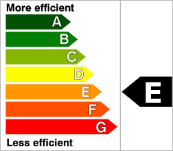
Key Performance Indicator
For more information about how to insert a KPI into the scorecard, refer to Key Performance Indicator.
There may be any number of tables below the KPI chart, and there may be any number of lines in each table.
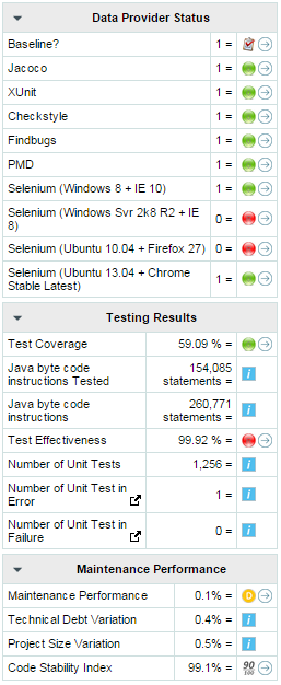
A scorecard information table using 3 tables with respectively 10, 7, and 4 lines.
A scorecard table is defined using the following syntax:
<tables displayContext="false" >
  <table name="My Table Name" id="TABLE_ID" opened="true">
  <line indicatorId="BUSINESS_VALUE" displayType="NAME"
  decimals="0" suffix="FP"
  emptyValue="-" exclude="TESTER" />
  <line indicatorId="QUALITY" displayType="NAME"
  decimals="1" suffix="%" />
  <line indicatorId="SI" displayType="NAME"
  decimals="1" suffix="%" />
  </table>
  <table id="TABLE_ID">
  ...
  </table>
  ...
</tables>
The tables
element
takes an optional displayContext
attribute that automatically inserts an Artefact context
table containing the current artefact's project, version and name, as shown below:
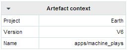
The artefact context table
The table name is not configurable
The table
element accepts the following attributes:
id
(mandatory) is used to find the localised
version of the table name in a .properties file.
name
(optional, default: empty) allows bypassing the search for a localised string
opened
(optional, default: false) defines whether a table is opened or collapsed by default
displayType
(optional, default: no default) defines the
displayType
to be used by all lines in this table. It can be overridden for each line if necessary. For
full details, consult the displayType reference for the line element.
displayOnlyIf (since 14-A)
(optional) allows specifying a computation to evaluate whether or not to show the chart in the dashboard. If
the result of the computation is more than 0, then the chart is displayed. Consult Chapter 5, Computation Syntax for
more information about the supported computation syntax. Note that computations used in
displayOnlyIf
have a limited scope: they only apply to the current node in its current version.
This means that the functions like PREVIOUS_VALUE(), PREVIOUS_INFO(), DELTA_VALUE(), APP(), ANCESTOR(), PARENT() or
IS_DP_OK() cannot be used with displayOnlyIf
.
The line
element accepts the following attributes:
indicatorId
is the unique identifier of the indicator to be displayed.
headerDisplayType
(at model-level) or
displayType
(at artefact-level)
(optional, default: MNEMONIC)
defines how the indicator is shown in the interface. It may be one
of NAME, MNEMONIC, or DESCRIPTION.
displayOnlyIf (since 14-A)
(optional) allows specifying a computation to evaluate whether or not to show the chart in the dashboard. If
the result of the computation is more than 0, then the chart is displayed. Consult Chapter 5, Computation Syntax for
more information about the supported computation syntax. Note that computations used in
displayOnlyIf
have a limited scope: they only apply to the current node in its current version.
This means that the functions like PREVIOUS_VALUE(), PREVIOUS_INFO(), DELTA_VALUE(), APP(), ANCESTOR(), PARENT() or
IS_DP_OK() cannot be used with displayOnlyIf
.
displayedValue
(optional)
allows overriding the indicator to display another measure instead.
The attribute takes a measure Id (displayedValue="SLOC").
displayType
(at model-level) or
displayValueType
(at artefact-level)
(optional, default: VALUE)
defines how the indicator's value is shown in the interface. It
may be one of:
NAME the level's name
MNEMONIC (since 13-A) the level's mnemonic
RANK (since 13-A) the level's rank
VALUE the measure's value
ICON the level's icon
DATE (since 13-A) the measure value converted to date format
DATETIME (since 13-A) the measure value converted to datetime format
TIME (since 13-A) the measure value converted to time format
TEXT (since 14-A) when the metric you are trying to display is textual information, as described in the section called “Using Textual Information From Artefacts”
For DATE,DATETIME and TIME, you can specify the required format using the dateStyle, timeStyle and datePattern attributes described below.
unknownValue
(optional, default: "?") (since 14-B) defines what text
to display if the level of the indicator is UNKNOWN or outside the specified dataBounds
. Set this to OFF
to use the old behaviour (which display the rank -1).
emptyValue
(optional, default: "-") (since 14-B) defines what text
to display if there is no value in the database for the specified metric, or if a date is not specified.
This is usually useful if a date has not been set yet manually in a form (and is therefore equal to 0), or if you have just added a
new metric to your model you want to display specific text for the versions of your project where this metric did
not exist yet.
dataBounds
(optional, default:[;[) (since 14-B) allows overriding the normal range of values that would trigger the display of the
unknownValue
text. This allows you to display the unknown value if the metric
associated with the indicator is not within the defined bounds.
dateStyle (optional, default: DEFAULT): the date formatting style,
used when the displayType is one of DATE or DATETIME.
timeStyle (optional, default: DEFAULT): the time formatting style,
used when the displayType is one of DATETIME or TIME. See above for available styles.datePattern (formerly dateFormat) (optional, default: empty): the date pattern, used when
the displayType is one of DATE,
DATETIME or TIME.
suffix
(optional, default: empty)
is the unit to be displayed after values.
decimals
(optional, default: 0)
is the number of decimals places to be used for displaying values (only
used with the VALUE display type).
roundingMode
(optional, default: HALF_EVEN)
defines the behaviour used for rounding the numerical values displayed. The supported values are:
CEILING to round towards positive infinity.
DOWN to round towards zero.
FLOOR to round towards negative infinity.
HALF_DOWN to round towards "nearest neighbour" unless both neighbours are equidistant, in which case round down.
HALF_EVEN to round towards the "nearest neighbour" unless both neighbours are equidistant, in which case, round towards the even neighbour.
HALF_UP to round towards "nearest neighbour" unless both neighbours are equidistant, in which case round up.
UP to round away from zero.
For more examples of rounding mode, consult http://docs.oracle.com/javase/6/docs/api/java/math/RoundingMode.html.
The links in the lines of the score card tables are generated automatically according to the metric that
the line displays. They will generally link to the list of findings that are used to compute
the metric. You can however override the URL and set your own external URL. In order to do this, ensure that the metric
MY_METRIC displayed in a table line has a
MY_METRIC.URL
property defined in a properties file in your model. For more information about properties files, consult the section called “Descriptions”.
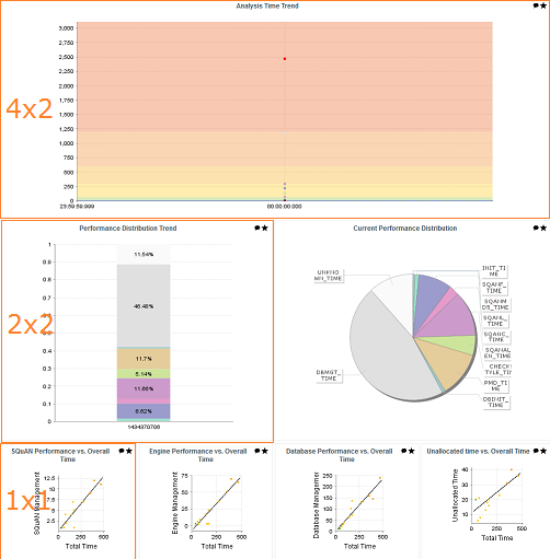
You can use dashboard templates to highlight some of the charts on your dashboard by changing their size in terms of grid slots they occupy. The following is an example template that uses 4 columns of charts with custom aspect ratios applied to the first three charts:
<?xml version="1.0" encoding="UTF-8"?>
<roles xmlns:xi="http://www.w3.org/2001/XInclude">
  <role name="DEFAULT">
    <dashboard nbColumns="4" type="APPLICATION" template="1:4x2;2:2x2;3:2x2">
       (...)
      <charts>
        <xi:include href="chart1.xml" />
        <xi:include href="chart2.xml" />
        <xi:include href="chart3.xml" />
        <xi:include href="chart4.xml" />
        <xi:include href="chart5.xml" />
        <xi:include href="chart6.xml" />
        <xi:include href="chart7.xml" />
      </charts>
    </dashboard>
  </role>
</roles>
Note that you only need to specify custom dimensions for non-standard charts sizes using the syntax "position:width x height;", other charts will use a 1x1 grid slot by default.
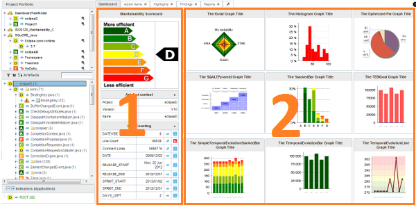
Charts are displayed on the right hand side of the dashboard. They
are defined through
chart
elements as follows:
<charts>
  <chart id="CHART_ID" type="CHART_TYPE">
  <indicator>INDICATOR_1</indicator>
  <indicator>INDICATOR_2</indicator>
  <indicator>INDICATOR_3</indicator>
  </chart>
  <chart id="CHART_ID">
  ...
  </chart>
  ...
</charts>
There are many types of charts, all referenced in this section. The best approach to finding the chart you want to use on your dashboard can be found by answering the following questions:
Should my chart display a trend or reflect the data for a single version of my project?
Is the information I want to display abut the current artefact or about its descendants?
Will my chart display one bit of information or combine several?
Is the information displayed by my chart quantitative or qualitative?
Answering these questions will lead you toward the type of chart you want to use. The table below shows the type of answer offered by each of the charts available in Squore:
Table 6.1. Charts for Single-Version Data Visualisation
| Current Artefact Data | Descendants of the Current Artefact | ||||||
| Quantitative Information | Qualitative Information | Quantitative Information | Qualitative Information | ||||
|
Single Dataset | Multiple Datasets |
Single Dataset | Multiple Datasets |
Single Dataset | Multiple Datasets |
Single Dataset | Multiple Datasets |
| N/A | |||||||
Table 6.2. Charts for Trend-Based Visualisation
| Current Artefact Data | Descendants of the Current Artefact | ||||||
| Quantitative Information | Qualitative Information | Quantitative Information | Qualitative Information | ||||
|
Single Dataset | Multiple Datasets |
Single Dataset | Multiple Datasets |
Single Dataset | Multiple Datasets |
Single Dataset | Multiple Datasets |
| N/A | N/A | N/A | N/A | N/A | |||
More information about charts and their configuration options can be found in Chapter 7, Charts Reference