| Installation and Administration | Getting Started | Command Line | Configuration | Eclipse Plugin | Reference Manual | API |
| Show on single page Show on multiple pages |
|
|
|
|
The Artefact Pie offers a graphical representation of the values of a specific measure for each child artefact in a pie chart. The Artefact Pie requires one measure
to define the size of the pie slice and accepts a colorFromIndicator
attribute to pick the colors of the pie slices based on a scale. Clicking a pie slice takes you to the dashboard of the corresponding artefact.
Artefact Pie
<chart type="ARTEFACTPIE" id="ARTEFACT_PIE_EXAMPLE" colorFromIndicator="ROOT" onlyDirectChildren="false" targetArtefactTypes="FILE">
	<measure>LC</measure>
</chart>
The chart
tag accepts the following attributes:
targetArtefactTypes
allows to filter descendants according to their type.
You can use one or more types. Concrete and abstract types are supported, so it is possible to use an alias,
as described in the section called “Artefact Types”.
For Stacked Bar Chart, Simple Temporal Evolution Stacked Bar Chart, Simple Pie, Simple Bar and Distribution Table, the measure and scale associated to the indicator must be the same for all types
onlyDirectChildren
(optional, default: true) includes artefacts that are direct children of the current artefact
when set to true, or all descendants of the current artefact when set to false.
colorFromIndicator
(optional, default: none) uses the specified indicator's colour scale to assign a colour to each item drawn on the chart.
The Artefact Series chart displays one or more metrics from descendent artefacts. The measure representation is defined by a renderer
attribute (as explained in the section called “Datasets and Renderers” ). The chart also allows clicking on an artefact to display its dashboard.
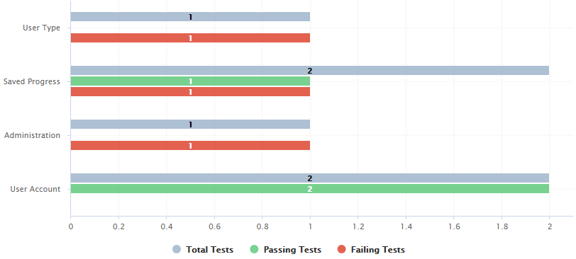
Artefact Series showing test statistics for child requirements
<chart type="ARTEFACTSERIES" id="ARTEFACT_SERIES_EXAMPLE" targetArtefactTypes="FILE;REQUIREMENT" onlyDirectChildren="false" inverted="true" orderByMeasure="NUM_FAILING_TESTS" renderer="BAR" orientation="HORIZONTAL">
	<measure color="CYAN">NUM_TESTS_CODE</measure>
	<measure color="GREEN">NUM_PASSING_TESTS</measure>
	<measure color="RED">NUM_FAILING_TESTS</measure>
</chart>
The Artefact Series can also be used to draw a stacked bar chart for child artefacts and include a line via the use of several datasets, as shown below:
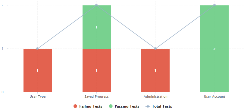
An alternate representation of the same data in an Artefact Series chart
<chart type="ARTEFACTSERIES" id="ARTEFACT_SERIES_STACKED_BAR_EXAMPLE" targetArtefactTypes="FILE;REQUIREMENT" onlyDirectChildren="false" inverted="true" orderByMeasure="NUM_FAILING_TESTS" orientation="VERTICAL">
	<dataset renderer="STACKED_BAR">
		<measure color="RED" >NUM_FAILING_TESTS</measure>
		<measure color="GREEN" >NUM_PASSING_TESTS</measure>
	</dataset>
		<dataset renderer="LINE" rangeAxis="TOTAL">
		<measure color="CYAN">NUM_TESTS_CODE</measure>
	</dataset>
	<rangeAxis id="TOTAL" color="CYAN" min="0" location="left" type="number" numberFormat="INTEGER" />
</chart>
The chart
element suports the following attributes:
targetArtefactTypes
allows to filter descendants according to their type.
You can use one or more types. Concrete and abstract types are supported, so it is possible to use an alias,
as described in the section called “Artefact Types”.
For Stacked Bar Chart, Simple Temporal Evolution Stacked Bar Chart, Simple Pie, Simple Bar and Distribution Table, the measure and scale associated to the indicator must be the same for all types
linkType
(alternative to targetArtefactTypes
) allows specifying a link ID to display
all artefacts linked to the current artefact on the chart. For more information about links, refer to the section called “Artefact Links”.
onlyDirectChildren
(optional, default: true) includes artefacts that are direct children of the current artefact
when set to true, or all descendants of the current artefact when set to false.
asPercentage
(optional, default: false) specifies whether the values are displayed as real values or percentages
displayEmptyData
(optional, default: false) forces the display of artefacts for which there is no corresponding data.
renderer (optional, default: BAR)
allows setting a common renderer for all measures in te chart. This can be omitted and overridden for individual datasets, as explained in the section called “Datasets and Renderers”.
orderByMeasure (optional, default: the first measure in the chart definition)
allows ordering the artefacts on the chart according to the specified measure.
inverted (optional, default: false)
allows reversing the default order of artefacts
You can specify as many measure
sub-elements as necessary for each artefact, using the syntax detailed in the section called “Common Attributes for measure and indicator
”.
The Artefact Table allows displaying a list of child artefacts and one or more of their characteristics in table format, as shown below:
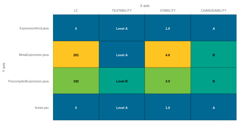
Artefact Table
<chart	type="ARTEFACTTABLE" id="ARTEFACT_TABLE_EXAMPLE" xLabel="X axis"yLabel="Y axis" onlyDirectChildren="true" targetArtefactTypes="FILE">
	<indicator>LC</indicator>
	<indicator displayValueType="NAME">TESTABILITY</indicator>
	<indicator displayValueType="RANK">STABILITY</indicator>
	<indicator displayValueType="MNEMONIC">CHANGEABILITY</indicator>
</chart>
In the example above, the indicators use different displayValueType
to show all the supported values.
The Artefact Table chart
element may have the following attributes:
targetArtefactTypes
allows to filter descendants according to their type. You can use one or more types.
Concrete and abstract types are supported, so it is possible to use an alias, as described in the section called “Artefact Types”.
onlyDirectChildren
(optional, default: false) includes artefacts that are direct children of the current artefact
when set to true, or all descendants of the current artefact when set to false.
orderByMeasure
(optional, alphabetical if omitted) allows sorting the list of artefacts according to the value of the specified measure ID.
inverted
(optional, default: false) allows reversing the sort order defined by the orderByMeasure
attribute.
displayEmptyData
(optional, default: false) forces the display of artefacts for which there is no corresponding data.
The Artefact Table chart takes one or more indicator
sub-elements, which can point to measures or indicators. Note that the table cells are automatically coloured according to the corresponding scale level colour when the metric displayed in the table is an indicator. This behaviour can be overridden by using the colorFromScale
attribute, which takes a scale ID to apply colour from according to the rank of the value displayed.
In addition, you can add a row and column to aggregate the results found in each table row or column using the row
or column
element. Each of these elements accepts the following attributes:
aggregationType
(optional, default: AVG in most charts, SUM in table charts) defines how the values for the
metrics on the chart are aggregated. The supported values are:
MIN
MAX
OCC
AVG
DEV
SUM
MED
MOD
label
(mandatory)
is a string that is displayed as the legend of the row or column.
color
(optional, default: GREY)
is the fill colour for the row or column. [colour syntax]
colorFromScale
(optional, default: empty)
allows filling cells with a colour taken from a specific scale.
The Artefact Time Series chart displays one or more metrics from descendent artefacts on a timeline. It offers the same features as the Artefact Series chart and also provides options to aggregate by time period.
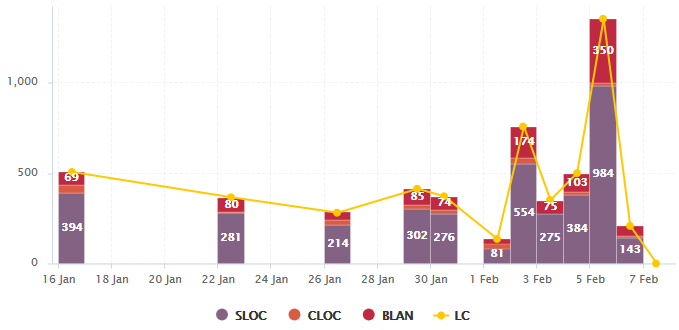
Artefact Time Series showing a daily timeline of files
<chart type="ArtefactTimeSeries" id="ARTEFACTTIMESERIES_EXAMPLE" targetArtefactTypes="FILE" onlyDirectChildren="false" timeMeasure="DATE_FILE" timeInterval="DAY" timeIntervalAggregationType="SUM" byTime="true" renderer="STACKED_BAR">
	<dataset renderer="STACKED_BAR">
		<measure>SLOC</measure>
		<measure>CLOC</measure>
		<measure>BLAN</measure>
	</dataset>

	<dataset renderer="LINE">
		<measure color="ORANGE">LC</measure>
	</dataset>
</chart>
In the example above, files are sorted by creation date on a daily timeline, with bars representing daily aggregates of serveral line count metrics for each files.
The chart
element suports the following attributes:
targetArtefactTypes
allows to filter descendants according to their type.
You can use one or more types. Concrete and abstract types are supported, so it is possible to use an alias,
as described in the section called “Artefact Types”.
For Stacked Bar Chart, Simple Temporal Evolution Stacked Bar Chart, Simple Pie, Simple Bar and Distribution Table, the measure and scale associated to the indicator must be the same for all types
onlyDirectChildren
(optional, default: true) includes artefacts that are direct children of the current artefact
when set to true, or all descendants of the current artefact when set to false.
timeMeasure
(mandatory) is the measure ID (of type DATE) used to place an artefact on the timeline
byTime
(optional, default: false) enforces the timeline display
For interval and aggregation settings, refer to the section called “Parameters for Temporal Charts”.
You can specify as many measure
sub-elements as necessary for each artefact, using the syntax detailed in the section called “Common Attributes for measure and indicator
”.
The Cell Artefact Table offers a tabular representation of descendent artefacts of a certain type with added grouping and filtering possibilities compared to other table charts.
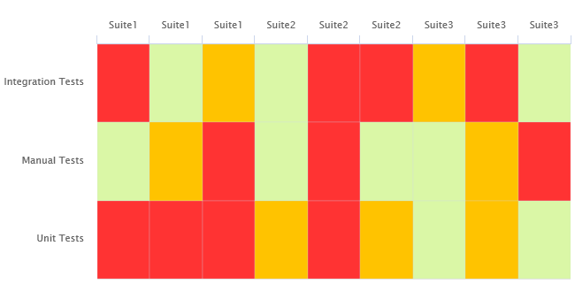
Cell Artefact Table
<chart	type="CellArtefactTable" id="CELLARTEFACTTABLE_EXAMPLE" targetArtefactTypes="SUITE" colorFromIndicator="ROOT" orderByMeasure="RUN_DATE" enabledAxisLabels="true" insideAxisLabels="false" artefactNameAsColumn="true">
	<groups>
		<group type="LINE" ancestorLevel="2" orderBy="NAME" />
	</groups>
</chart>
The test tree represented in the example chart shows each test suite as a cell, grouped on the same line by ancestor level -2 (the type of testing activity).
The chart
tag accepts the following attributes:
targetArtefactTypes
allows to filter descendants according to their type.
You can use one or more types. Concrete and abstract types are supported, so it is possible to use an alias,
as described in the section called “Artefact Types”.
For Stacked Bar Chart, Simple Temporal Evolution Stacked Bar Chart, Simple Pie, Simple Bar and Distribution Table, the measure and scale associated to the indicator must be the same for all types
colorFromIndicator
(optional, default: none) uses the specified indicator's colour scale to assign a colour to each item drawn on the chart.
orderByMeasure
(optional, alphabetical if omitted) allows sorting the list of artefacts according to the value of the specified measure ID.
enabledAxisLabels
(optional, default: true) allows showing (true) or hiding (false) axis labels
insideAxisLabels
(optional, default: false) allows printing the axis labels to the right of the y-axis (true) instead of to the left (false)
artefactNameAsColumn
(optional, default: false) allows printing the artefact names inside the cells (false) or at the top of each column (true)
Grouping can be achieved via a group
element defining an ancestorLevel
:
<groups>
	<group type="COLUMNS" ancestorLevel="1" />
	<group type="LINE" ancestorLevel="2" orderBy="NAME" />
	<group type="LINES" ancestorLevel="1" orderBy="NAME" />
</groups>
You can also filter which artefacts are to be displayed as cells checking a condition on their ancestors.
Include tests suites in the chart only if they are under a critical tested component:
<ancestors>
	<where artefactTypes="TEST_COMPONENT" measureId="IS_CRITICAL" value="1" />
</ancestors>
Include test suites in the chart only if they are linked to a library of ASIL level 2 or more
<ancestors>
	<where artefactTypes="LIBRARY" measureId="ASIL_LEVEL" bounds="[2;[" />
</ancestors>
The Dial chart represents the value of the measure associated to an indicator against a backdrop of the scale associated to this indicator. The Dial chart requires one indicator
as a sub-element.
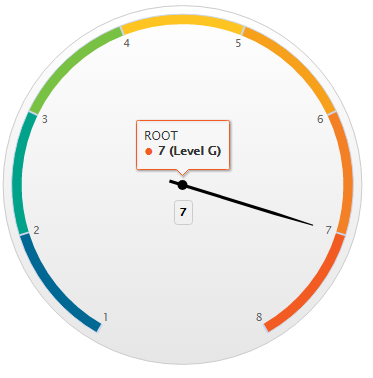
Dial Chart
<chart type="DIAL" id="DIAL_EXAMPLE">
	<indicator>ROOT</indicator>
</chart>
The Dial chart
element may have the following attributes:
The majorTickIncrement
and minorTickCount
parameters only need to be used if you want to completely control the appearance of the chart. Generally, they can be omitted, as the defaults should be smart enough to show what you need.
You can control the bounds of the axis of this chart using the datBounds attributs on each metric,
as explained in the section called “Common Attributes for measure and indicator
”.
The indicator
element supports excluding
certain levels from the chart by using the
excludeLevels
attribute. For
example:
<indicator excludeLevels="LEVELA;LEVELB">LEVEL</indicator>
The Distribution Table is an matrix-like visualisation of two characteristics of an artefact's descendants
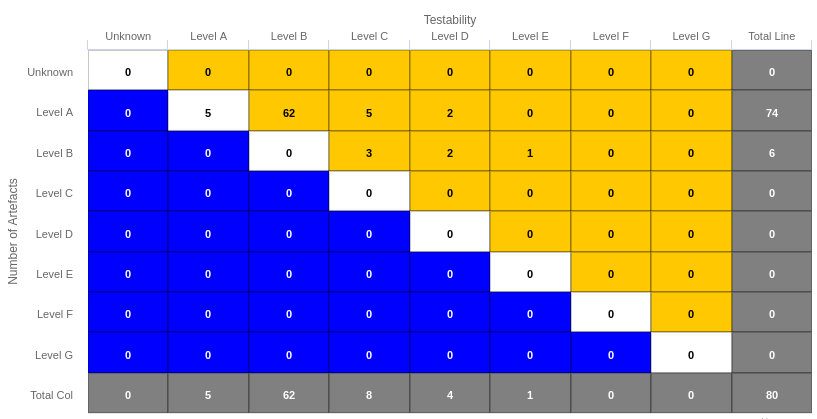
Distribution Table
<chart type="DISTRIBUTIONTABLE" id="DIST_TABLE_FIXED_COLOR_EXAMPLE" targetArtefactTypes="FILE" xLabel="Testability" yLabel="Number of Artefacts" topColor="ORANGE" bottomColor="BLUE">
	<indicator>ROOT</indicator>
	<indicator>TESTABILITY</indicator>
	<row aggregationType="SUM" label="Total Col" color="GRAY" />
	<column aggregationType="SUM" label="Total Line" color="GRAY" />
</chart>
The Distribution Table chart
element may have the following attributes:
targetArtefactTypes
allows to filter descendants according to their type. You can use one or more types.
Concrete and abstract types are supported, so it is possible to use an alias, as described in the section called “Artefact Types”.
color
(optional, default: WHITE) is the colour used to fill all the cells in the table. An example Distribution Table using color
is shown later in this section. [colour syntax] .
Instead of using a single colour for the entire table, you can use
topColor
, middleColor
and bottomColor
to colour the top, middle and
bottom sections of the chart respectively in different colours, as in the main example above. [colour syntax]
colorFromScale
(optional, default: none) is the colour scale used to fill the cells in the table according to the rank of each cell. An example Distribution Table using colorFromScale
is shown later in this section.
If several colour attributes are found, they are applied in this order:
The Distribution Table chart takes two indicator
sub-element that will be used to build a matrix of scale levels.
In addition, you can add a row and column to aggregate the results found in each table row or column using the row
or column
element. Each of these elements accepts the following attributes:
aggregationType
(optional, default: AVG in most charts, SUM in table charts) defines how the values for the
metrics on the chart are aggregated. The supported values are:
MIN
MAX
OCC
AVG
DEV
SUM
MED
MOD
label
(mandatory)
is a string that is displayed as the legend of the row or column.
color
(optional, default: GREY)
is the fill colour for the row or column. [colour syntax]
colorFromScale
(optional, default: empty)
allows filling cells with a colour taken from a specific scale.
Some simpler examples of Distribution Table charts can be found below:
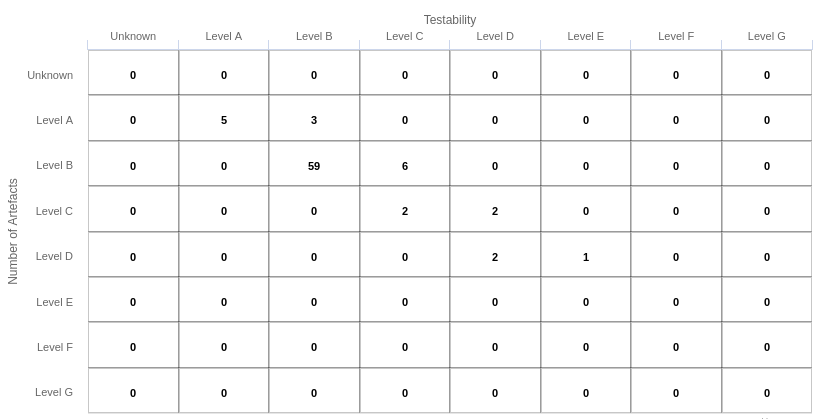
Simple Distribution Table
<chart type="DISTRIBUTIONTABLE" id="DIST_TABLE_EXAMPLE" targetArtefactTypes="FILE" xLabel="Testability" yLabel="Number of Artefacts">
	<indicator>ROOT</indicator>
	<indicator>ANALYSABILITY</indicator>
</chart>
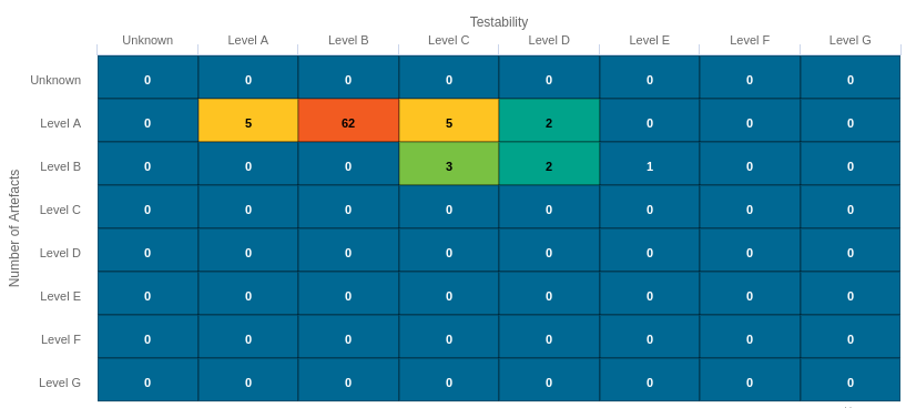
Distribution Table with cells coloured according to a scale
Chart:
<chart type="DISTRIBUTIONTABLE" id="DIST_TABLE_SCALE_COLOR_EXAMPLE" targetArtefactTypes="FILE" xLabel="Testability" yLabel="Number of Artefacts" colorFromScale="SCALE_TEST_BASIC">
	<indicator>ROOT</indicator>
	<indicator>TESTABILITY</indicator>
</chart>


Scale:
<Scale scaleId="SCALE_TEST_BASIC">
	<ScaleLevel levelId="LEVELA" bounds="];1]" rank="1" />
	<ScaleLevel levelId="LEVELB" bounds="]1;2]" rank="2" />
	<ScaleLevel levelId="LEVELC" bounds="]2;4]" rank="3" />
	<ScaleLevel levelId="LEVELD" bounds="]4;8]" rank="4" />
	<ScaleLevel levelId="LEVELE" bounds="]8;16]" rank="5" />
	<ScaleLevel levelId="LEVELF" bounds="]16;32]" rank="6" />
	<ScaleLevel levelId="LEVELG" bounds="]32;[" rank="7" />
</Scale>
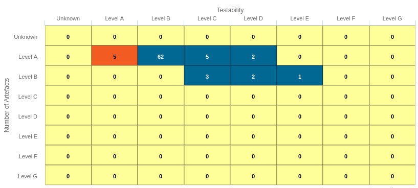
Simple Distribution Table with red/green
Chart:
<chart type="DISTRIBUTIONTABLE" id="DIST_TABLE_SCALE_COLOR_TWO_COLORS_EXAMPLE" targetArtefactTypes="FILE" xLabel="Testability" yLabel="Number of Artefacts" topColorFromScale="SCALE_GREEN" middleColorFromScale="SCALE_RED" bottomColorFromScale="SCALE_RED">
	<indicator>ROOT</indicator>
	<indicator>TESTABILITY</indicator>
</chart>


Scales:

<Scale scaleId="SCALE_GREEN">
	<ScaleLevel levelId="BLANK" bounds="];1[" rank="-1" />
	<ScaleLevel levelId="LEVELA" bounds="[1;[" rank="1" />
</Scale>

<Scale scaleId="SCALE_RED">
	<ScaleLevel levelId="BLANK" bounds="];1[" rank="-1" />
	<ScaleLevel levelId="LEVELG" bounds="[1;[" rank="1" />
</Scale>
A typical Histogram that shows the repartition of a value for the children of the selected artefact It requires one measure
element.
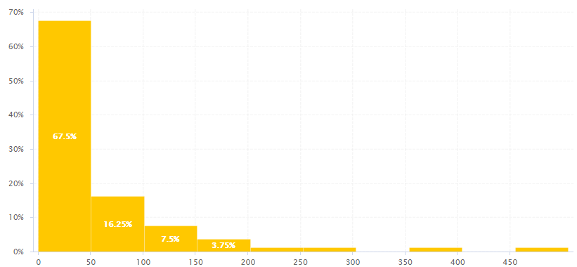
Histogram
<chart type="HISTOGRAM" id="HISTOGRAM_EXAMPLE" targetArtefactTypes="FILE" nbBars="10">
	<measure color="ORANGE">LC</measure>
</chart>
The chart
element may have the following attributes:
targetArtefactTypes
allows to filter descendants according to their type.
You can use one or more types. Concrete and abstract types are supported, so it is possible to use an alias,
as described in the section called “Artefact Types”.
For Stacked Bar Chart, Simple Temporal Evolution Stacked Bar Chart, Simple Pie, Simple Bar and Distribution Table, the measure and scale associated to the indicator must be the same for all types
You can control the bounds of the axis of this chart using the datBounds attributs on each metric,
as explained in the section called “Common Attributes for measure and indicator
”.
The Key Performance Indicator chart is used to display the rating of the root indicator for artefact.
Key Performance Indicator
<chart type="KPI" id="KPI_EXAMPLE" indicatorId="ROOT" />
The chart
accepts the following attributes:
indicatorId
is the reference to an Indicator. See the section called “Descriptions” for more information about the indicatorId
.
You can configure the image displayed by Key Performance Indicator chart by defining an image per scale level in your model:
<SQUORE_HOME>/configuration/models/shared/Analysis/SQuORE_PerformanceLevels_en.properties:
LOP.LEVELA.IMAGE=../Shared/Images/images/perfA.png
LOP.LEVELB.IMAGE=../Shared/Images/images/perfB.png
LOP.LEVELC.IMAGE=../Shared/Images/images/perfC.png
LOP.LEVELD.IMAGE=../Shared/Images/images/perfD.png
LOP.LEVELE.IMAGE=../Shared/Images/images/perfE.png
LOP.LEVELF.IMAGE=../Shared/Images/images/perfF.png
LOP.LEVELG.IMAGE=../Shared/Images/images/perfG.png
For more information about properties files, consult the section called “Descriptions”.
The Indicator now offers a more dynamic way to display a KPI without the need to create images for every level on a scale. You can find out more about this chart in Indicator.
The Kiviat chart displays three or more indicators in a radar-type chart.
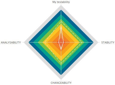
Kiviat
The Kiviat chart takes a set of at least three indicators as sub-elements.
<chart type="KIVIAT" id="KIVIAT_EXAMPLE" isInverted="true">
	<indicator label="My testability" objective="LEVELC">TESTABILITY</indicator>
	<indicator objective="LEVELC">STABILITY</indicator>
	<indicator objective="LEVELC">CHANGEABILITY</indicator>
	<indicator objective="LEVELD">ANALYSABILITY</indicator>
</chart>
The attributes allowed for the chart
element are the following:
The indicator
element accepts a specific, optional objective
attribute that draws a dotted line at the specified level representing the objective line.
The objective attribute accepts:
A scale level (LEVELA)
An indicator ID (TESTABILITY). In this case, both indicators must use the same scale.
A computation (LC+100). The computed value is then used together with the scale of the indicator to define the level to display.
Note that only a scale level is accepted for Kiviat charts in Model/Group Dashboards.
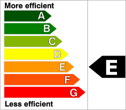
The Indicator displays the rating of the current artefact for a specific indicator.
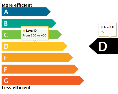
Indicator with tooltips showing information about the scale for the indicator (left) and the actual rating of the artefact (right)
<chart type="INDICATOR" id="INDICATOR_EXAMPLE" topText="More efficient" bottomText="Less efficient">
	<indicator excludeLevels="UNKNOWN">ROOT</indicator>
</chart>
The chart
takes exactly one indicator
element and
accepts the following attributes:
The colours and level names displayed on the by Indicator are taken from the configuration of the scale levels for your indicator in your model:
<SQUORE_HOME>/configuration/models/shared/Analysis/SQuORE_PerformanceLevels_en.properties:
LOP.LEVELA.MNEMO=A
LOP.LEVELA.NAME=Level A
LOP.LEVELA.COLOR=#006893

LOP.LEVELB.MNEMO=B
LOP.LEVELB.NAME=Level B
LOP.LEVELB.COLOR=#00a38a
...
For more information about properties files, consult the section called “Descriptions”.
The Optimised Bar chart is a bar chart that takes several measure as input. It simply displays a bar chart with the values previously computed.
Optimised Bar
<chart type="OPTIMIZEDBAR" id="OPTIMIZED_BAR_EXAMPLE" asPercentage="true">
	<measure color="#006893" label="A">A_FILE</measure>
	<measure color="#67C8B9" label="B">B_FILE</measure>
	<measure color="#79C142" label="C">C_FILE</measure>
	<measure color="#FEC422" label="D">D_FILE</measure>
	<measure color="#F6A01B" label="E">E_FILE</measure>
	<measure color="#F48026" label="F">F_FILE</measure>
	<measure color="#F25B21" label="G">G_FILE</measure>
</chart>
The Optimised Bar requires a minimum of two measure
elements and supports the following attributes:
decimals
(optional, default: 0) is the number of decimals places to be used for displaying values
displayEmptyValue
(optional, default: false) -- Deprecated, should be replaced with displayEmptyData
specifies whether categories with no value or a value of 0 are included on the chart
asPercentage
(optional, default: false) specifies whether the values are displayed as real values or percentages
displayGlobalPercentage
(optional, default: false) (new in 18.0) allows showing the global percentage value for each bar in the tooltip next to the relative percentage value..
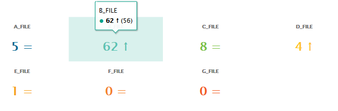
The Optimised Pie chart is a pie chart that takes several measure as input. It simply displays a pie chart with the values previously computed.
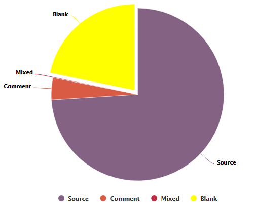
Optimised Pie Chart
<chart type="OPTIMIZEDPIE" id="OPTIMIZED_PIE_EXAMPLE" decimals="2">
	<measure label="Source">SLOC_ONLY</measure>
	<measure label="Comment">CLOC_ONLY</measure>
	<measure label="Mixed">MLOC</measure>
	<measure color="YELLOW" label="Blank">BLAN</measure>
</chart>
The Optimised Pie requires a minimum of two measure
elements and
supports the following attributes:
The Pivot Table (new in 18.0) displays, combines and summarises information from several metrics, grouping them by indicator level. The Pivot Table displays a column per included metric and a column showing the total count of artefacts for each line.
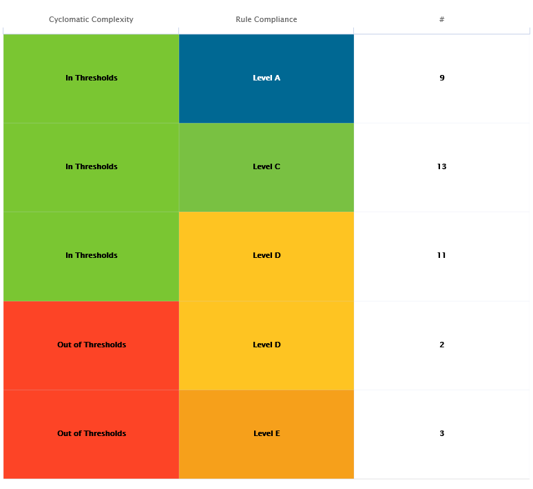
A Pivot Table crossing results of the rule compliance and cyclomatic complexity indicators for all functions in a project
<chart id="PIVOT_TABLE_EXAMPLE" type="PIVOTTABLE" targetArtefactTypes="FUNCTION">
  <indicator>VG</indicator>
  <indicator>RULE_ADH</indicator>
</chart>
The chart
takes one or more indicator
, measure
or info
elements and
accepts the following attributes:
colorFromScale
(optional, default: empty, uses the scale from the first column of the chart) allows filling cells with a colour taken from a specific scale.
orderByCount
(optional, default: false) allows ordering the table according to the count column when set to true instead of using the scale of the first column of the chart.
countBounds
(optional, default: none) allows setting data bounds for the count column. If the value is outside the defined interval, then the line is excluded from the Pivot Table.
inverted
(optional, default: false) allows reversing the sort order of lines in the chart.
displayEmptyData
(optional, default: false) forces the display of artefacts for which there is no corresponding data.
The Quadrant chart displays information about the descendants of the current artefact. Three measures are required to construct the chart: one for the X-axis, one for the Y-axis one for the size of the bubbles. The chart also allows to set markers to define coloured areas.
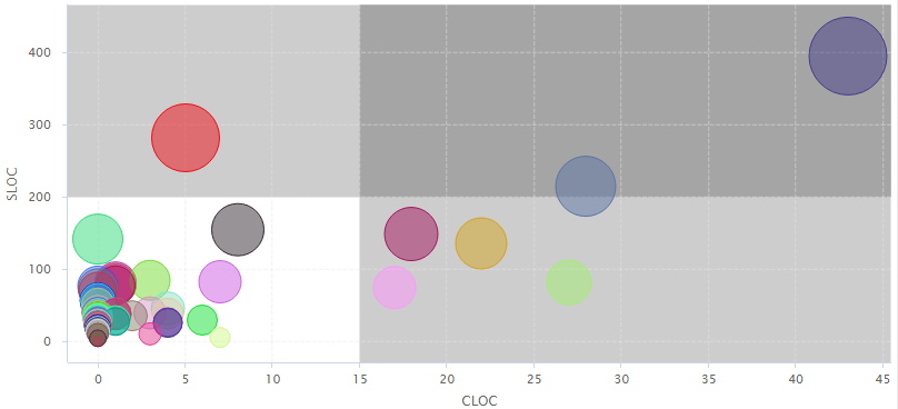
Quadrant Chart
<chart type="QUADRANT" id="QUADRANT_EXAMPLE" targetArtefactTypes="FILE">
	<xmeasure>CLOC</xmeasure>
	<ymeasure>SLOC</ymeasure>
	<zmeasure>LC</zmeasure>
	<markers>
		<marker value="15" color="BLACK" alpha="50" isVertical="true" />
		<marker value="200" color="BLACK" alpha="50" isVertical="false" />
	</markers>
</chart>
The chart
element may have the following attributes:
targetArtefactTypes
allows to filter descendants according to their type.
You can use one or more types. Concrete and abstract types are supported, so it is possible to use an alias,
as described in the section called “Artefact Types”.
For Stacked Bar Chart, Simple Temporal Evolution Stacked Bar Chart, Simple Pie, Simple Bar and Distribution Table, the measure and scale associated to the indicator must be the same for all types
linkType
(alternative to targetArtefactTypes
) allows specifying a link ID to display
all artefacts linked to the current artefact on the chart. For more information about links, refer to the section called “Artefact Links”.
onlyDirectChildren
(optional, default: false) includes artefacts that are direct children of the current artefact
when set to true, or all descendants of the current artefact when set to false.
colorFromIndicator
(optional, default: none) uses the specified indicator's colour scale to assign a colour to each item drawn on the chart.
The Artefact Scrumboard offers a graphical representation of child artefacts organised into categories (levels on a scale). Each artefact is represented as a sticky note and is clickable so you can reach the artefact's dashboard directly from the scrumboard.
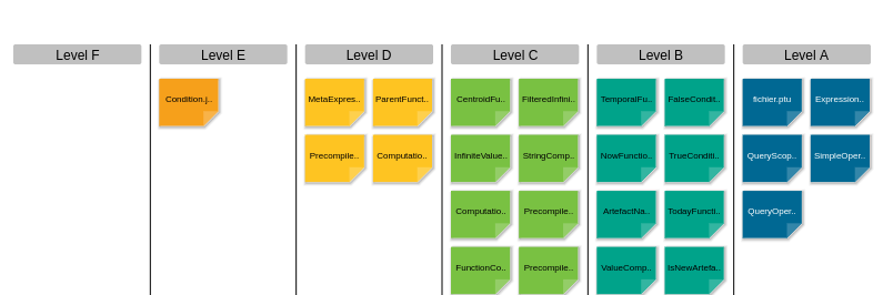
Artefact Scrumboard
<chart type="ARTEFACTSCRUMBOARD" id="ARTEFACT_SCRUMBOARD_EXAMPLE" targetArtefactTypes="FILE" postitByColumn="2" displayEmptyData="true" orderByMeasure="SLOC" invertedLevels="true">
	<indicator excludeLevels="UNKNOWN;LEVELG">ROOT</indicator>
</chart>
The chart
tag accepts the following attributes:
targetArtefactTypes
allows to filter descendants according to their type.
You can use one or more types. Concrete and abstract types are supported, so it is possible to use an alias,
as described in the section called “Artefact Types”.
For Stacked Bar Chart, Simple Temporal Evolution Stacked Bar Chart, Simple Pie, Simple Bar and Distribution Table, the measure and scale associated to the indicator must be the same for all types
onlyDirectChildren
(optional, default: false) includes artefacts that are direct children of the current artefact
when set to true, or all descendants of the current artefact when set to false.
colorFromIndicator
(optional, default: none) uses the specified indicator's colour scale to assign a colour to each item drawn on the chart.
invertedLevels
(optional, default: false) reverses the order of the scale levels on the board when set to true.
postitByColumn
(optional, default: 3) specifies the minimum number of sticky notes to display per line in each category.
maxPostitWidth
(optional, default: dynamic) specifies the maximum width to draw sticky notes. This setting may override the value of postitByColumn in some cases.
displayEmptyData
(optional, default: false) forces the display of all levels in the scale when set to true, even if there are no artefacts for that level.
orderByMeasure
(optional) allows ordering sticky notes in a category according to a specific measure.
inverted
(optional, default: false) reverses the order of sticky notes in each category when set to true (still using the measure defined by orderByMeasure
).
The Artefact Scrumboard requires exactly one indicator
elements to use its scale levels as scrumboard categories.
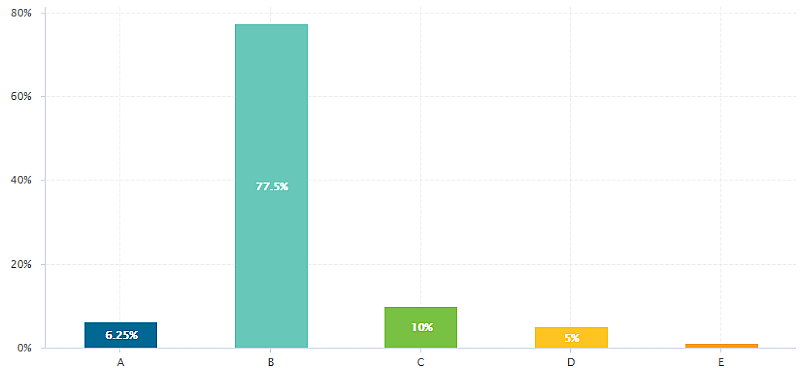
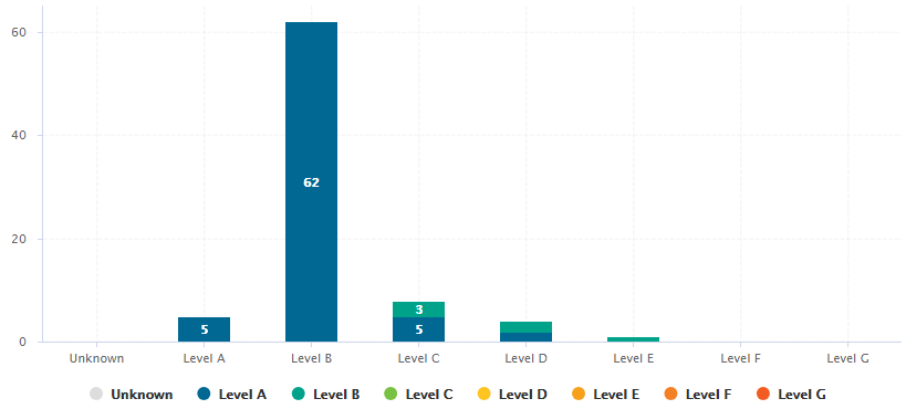
The Simple Bar chart presents the aggregation of the different ratings found in all the children of the selected artefact as a histogram.
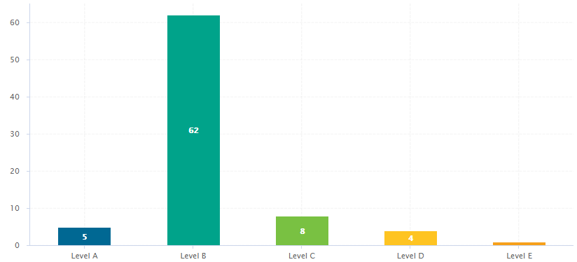
Simple Bar
<chart type="SIMPLEBAR" id="SIMPLE_BAR_EXAMPLE" targetArtefactTypes="FILE">
	<indicator>LEVEL</indicator>
</chart>
The Simple Bar chart
element may have the following attributes:
targetArtefactTypes
allows to filter descendants according to their type.
You can use one or more types. Concrete and abstract types are supported, so it is possible to use an alias,
as described in the section called “Artefact Types”.
For Stacked Bar Chart, Simple Temporal Evolution Stacked Bar Chart, Simple Pie, Simple Bar and Distribution Table, the measure and scale associated to the indicator must be the same for all types
decimals
(optional, default: 0) is the number of decimals places to be used for displaying values
displayEmptyValue
(optional, default: false) -- Deprecated, should be replaced with displayEmptyData
specifies whether categories with no value or a value of 0 are included on the chart
asPercentage
(optional, default: false) specifies whether the values are displayed as real values or percentages
The Simple Bar chart takes only one indicator
or info
as a sub-element.
For more details about how to use textual information, refer to the section called “Common Attributes for info
”
The indicator
element supports hiding or excluding
certain levels from the chart by using the hideLevels
excludeLevels
attribute. The difference between
hiding and excluding a level is that hidden levels are taken into account when displaying percentages while
excluded levels are not. For example:
<indicator excludeLevels="UNKNOWN">LEVEL</indicator>
or
<indicator hideLevels="LEVELA;LEVELB">LEVEL</indicator>
The Simple Pie chart presents the aggregation of the different ratings found in all the children of the selected artefact.
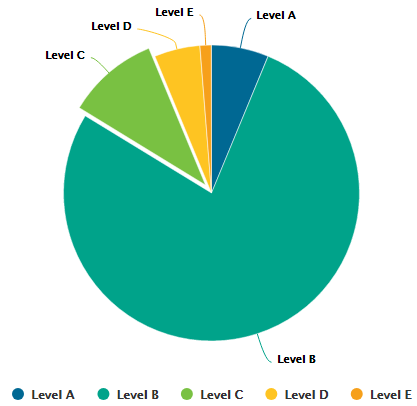
Simple Pie
<chart type="SIMPLEPIE" id="SIMPLE_PIE_EXAMPLE" targetArtefactTypes="FILE">
	<indicator>ROOT</indicator>
</chart>
The Simple Pie chart
element may have the following attributes:
targetArtefactTypes
allows to filter descendants according to their type.
You can use one or more types. Concrete and abstract types are supported, so it is possible to use an alias,
as described in the section called “Artefact Types”.
For Stacked Bar Chart, Simple Temporal Evolution Stacked Bar Chart, Simple Pie, Simple Bar and Distribution Table, the measure and scale associated to the indicator must be the same for all types
displayEmptyValue
(optional, default: false) -- Deprecated, should be replaced with displayEmptyData
specifies whether categories with no value or a value of 0 are included on the chart
decimals
(optional, default: 0) is the number of decimals places to be used for displaying values
The Simple Pie chart takes only one indicator
or info
as a sub-element.
For more details about how to use textual information, refer to the section called “Common Attributes for info
”.
The indicator
element supports excluding
certain levels from the chart by using the
excludeLevels
attribute. For
example:
<indicator excludeLevels="LEVELA;LEVELB">LEVEL</indicator>
Note: This chart is equivalent to using an Optimised Pie Chart with the definition shown below. The pie chart is optimised because the measures it uses have already been computed during the analysis and do not need to be calculated on the fly.
<chart type="OptimizedPie" decimals="2" >
	<measure color="0,81,0" label="A">A_FILE</measure>
	<measure color="3,127,3" label="B">B_FILE</measure>
	<measure color="133,182,2" label="C">C_FILE</measure>
	<measure color="255,255,0" label="D">D_FILE</measure>
	<measure color="255,150,0" label="E">E_FILE</measure>
	<measure color="255,80,0" label="F">F_FILE</measure>
	<measure color="255,0,0" label="G">G_FILE</measure>
</chart>
This chart represents the SQALE Pyramid, representing a minimum of two different measures or indicators as a matrix.
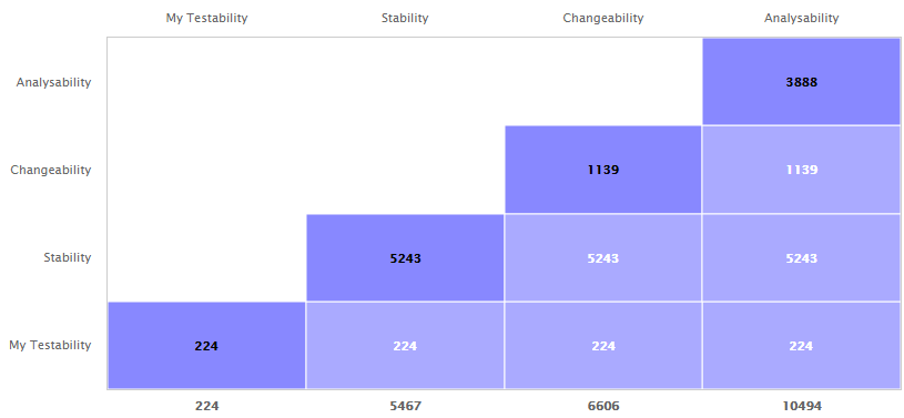
SQALE Pyramid
<chart type="SQALEPYRAMID" id="SQALEPYRAMID_EXAMPLE">
	<measure label="My Testability">CLOC</measure>
	<measure label="Stability">LC</measure>
	<measure label="Changeability">BLAN</measure>
	<measure label="Analysability">SLOC</measure>
</chart>
The Stacked Bar crosses the performance levels of two indicators, measures or textual infos (new in 18.0) for the children of the selected artefact along two axes.
Stacked Bar Chart chart
<chart type="STACKEDBAR" id="STACKED_BAR_EXAMPLE" targetArtefactTypes="FILE">
	<indicator>ROOT</indicator>
	<indicator>TESTABILITY</indicator>
</chart>
The chart
element may have the following attributes:
targetArtefactTypes
allows to filter descendants according to their type.
You can use one or more types. Concrete and abstract types are supported, so it is possible to use an alias,
as described in the section called “Artefact Types”.
For Stacked Bar Chart, Simple Temporal Evolution Stacked Bar Chart, Simple Pie, Simple Bar and Distribution Table, the measure and scale associated to the indicator must be the same for all types
displayEmptyData
(optional, default: false) forces the display of artefacts for which there is no corresponding data.
inverted
(optional, default: false) (new in 18.0) reverses the order of the bars on the chart when set to true.
asPercentage
(default: false) displays the values as percentages when set to true.
The chart support two indicator
, measure
or info
(new in 18.0) elements.
The indicator
element supports hiding or excluding
certain levels from the chart by using the hideLevels
excludeLevels
attribute. The difference between
hiding and excluding a level is that hidden levels are taken into account when displaying percentages while
excluded levels are not. For example:
<indicator excludeLevels="UNKNOWN">LEVEL</indicator>
or
<indicator hideLevels="LEVELA;LEVELB">LEVEL</indicator>
The Text Values chart is used to display one or more metrics as a large clickable element in your dashboard. The chart also optionally displays the trend for the displayed metrics.
Text Values
<chart type="TEXTVALUES" id="TEXTVALUES_EXAMPLE" layout="4x3" displayEvolution="true">
	<measure color="#006893">A_FILE</measure>
	<measure color="#00a38a">B_FILE</measure>
	<measure color="#79c142">C_FILE</measure>
	<measure color="#fec422">D_FILE</measure>
	<measure color="#f6a01b">E_FILE</measure>
	<measure color="#f48026">F_FILE</measure>
	<measure color="#f25b21">G_FILE</measure>
</chart>
The chart
accepts the following attributes:
layout
(optional, default: 1x1) defines how to display the metrics on the chart in terms of rows and columns.
titleColor
(optional, default: #707070) is the color of the label for chart's title.
displayEvolution
(optional, default: false) allows displaying trends next to the metric's value on the chart.
The Treemap offers a graphical representation of child artefacts as a set of tiled rectangles. The Treemap requires one measure
to define the size of the tiles and accepts a colorFromIndicator
attribute to pick the colors of the tiles. Tiles are generated from largest to smallest, and from top left to bottom right. Clicking a tile takes you to the dashboard of the corresponding artefact.
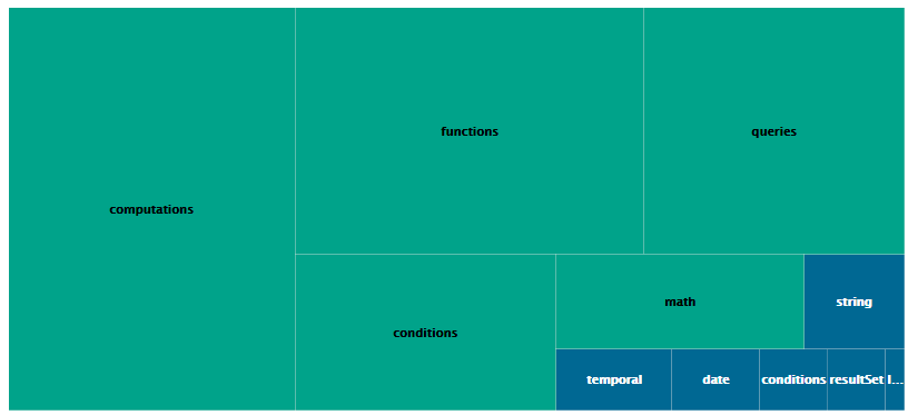
Treemap
<chart type="TREEMAP" id="TREEMAP_EXAMPLE" colorFromIndicator="ROOT" onlyDirectChildren="false" targetArtefactTypes="FOLDER">
	<measure>LC</measure>
</chart>
The chart
tag accepts the following attributes:
targetArtefactTypes
allows to filter descendants according to their type.
You can use one or more types. Concrete and abstract types are supported, so it is possible to use an alias,
as described in the section called “Artefact Types”.
For Stacked Bar Chart, Simple Temporal Evolution Stacked Bar Chart, Simple Pie, Simple Bar and Distribution Table, the measure and scale associated to the indicator must be the same for all types
linkType
(alternative to targetArtefactTypes
) allows specifying a link ID to display
all artefacts linked to the current artefact on the chart. For more information about links, refer to the section called “Artefact Links”.
onlyDirectChildren
(optional, default: true) includes artefacts that are direct children of the current artefact
when set to true, or all descendants of the current artefact when set to false.
colorFromIndicator
(optional, default: none) uses the specified indicator's colour scale to assign a colour to each item drawn on the chart.
defaultColor
(optional, default: RANDOM colour based on artefact name) uses an indicator's colour scale to assign a colour to each drawn tile. [colour syntax]
artefactsLimit
(optional, default: 2000) allows limiting the number of child artefacts to include.
maxDisplayableLabels
(optional, default: 250) allows you to limit the number of tiles that get a label on a treemap. This is only useful if you have large treemaps that cause performance issues.
The X/Y-Cloud chart is a visual representation of the values of two measures or indicators for the children of the selected artefact. For each child of the requested type, a dot is drawn with the value found for the selected measure.
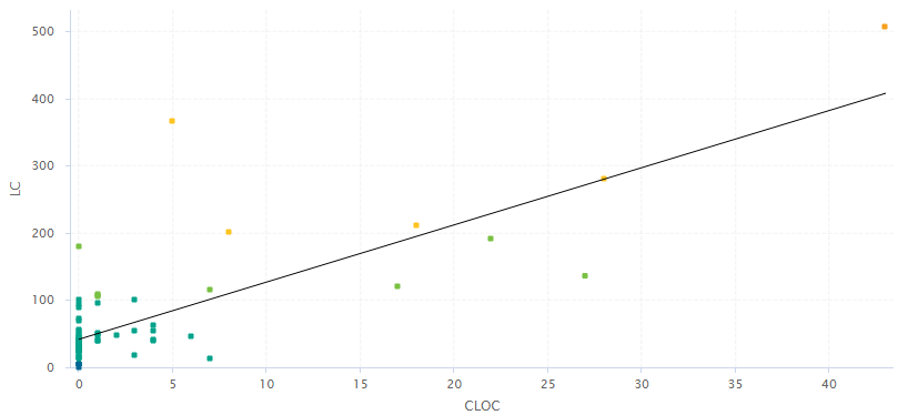
X/Y-Cloud Chart
<chart type="CORRELATEDCLOUD" id="CORRELATED_CLOUD_EXAMPLE" targetArtefactTypes="FILE" coeff="1" colorFromIndicator="LEVEL">
	<xmeasure>TESTABILITY</xmeasure>
	<ymeasure>STABILITY</ymeasure>
</chart>
The chart
element may have the following attributes:
targetArtefactTypes
allows to filter descendants according to their type.
You can use one or more types. Concrete and abstract types are supported, so it is possible to use an alias,
as described in the section called “Artefact Types”.
For Stacked Bar Chart, Simple Temporal Evolution Stacked Bar Chart, Simple Pie, Simple Bar and Distribution Table, the measure and scale associated to the indicator must be the same for all types
showPolynomialRegression
(optional, default: true) Whether the polynomial regression is drawn (true) or not drawn (false) on the chart.
coeff
(optional, default: 1) the degree of the drawn polynomial. Supported values are:
1 for linear
2 for quadratic
3 for cubic
colorFromIndicator
(optional, default: none) uses the specified indicator's colour scale to assign a colour to each item drawn on the chart.
shape
(optional, default: SQUARE) defines the shape of the points on the chart. The supported values are:
SQUARE
CIRCLE
DIAMOND
UP_TRIANGLE
DOWN_TRIANGLE
RIGHT_TRIANGLE
LEFT_TRIANGLE
HORIZONTAL_RECTANGLE
VERTICAL_RECTANGLE
HORIZONTAL_ELLIPSE
VERTICAL_ELLIPSE
shapeWidth
(optional, default: 4.0) defines the width of the point on the maximised chart.
miniShapeWidth
(optional, default: 2.0) defines the width of the point on the chart thumbnail.
The chart takes one xmeasure
element and one ymeasure
with the following attributes.
The Y-Cloud chart is a visual representation of the values of a measure or indicator for the children of the selected artefact. For each child of the requested type, a dot is drawn with the value found for the selected measure. The chart requires one indicator
element.
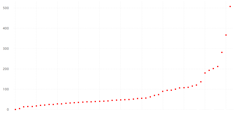
Y-Cloud Chart
<chart type="YCloud" id="YCLOUD_EXAMPLE" targetArtefactTypes="FILE">
	<indicator color="RED">LC</indicator>
</chart>
The chart
element may have the following attributes:
targetArtefactTypes
allows to filter descendants according to their type.
You can use one or more types. Concrete and abstract types are supported, so it is possible to use an alias,
as described in the section called “Artefact Types”.
For Stacked Bar Chart, Simple Temporal Evolution Stacked Bar Chart, Simple Pie, Simple Bar and Distribution Table, the measure and scale associated to the indicator must be the same for all types