| Installation and Administration | Getting Started | Command Line | Configuration | Eclipse Plugin | Reference Manual |
| Show on single page Show on multiple pages |
|
|
|
|
Charts that include axes also allow the use of markers. Markers are coloured regions of the chart area that help put the displayed value into context. For example, you could display a line chart of the evolution of the main indicator for your project and use markers to visually associate the value of the indicator with its level, as shown below:
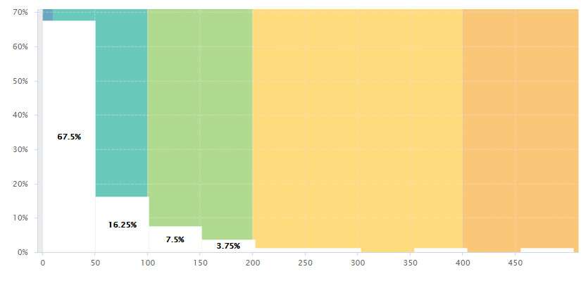
File size distribution in a project, using markers to draw zones corresponding to a scale gauging files by size
<chart type="Histogram" id="MARKERS_EXAMPLE" targetArtefactTypes="FILE" nbBars="10">
	<measure color="WHITE">LC</measure>
	<markers>
		<marker fromIndicator="LC" alpha="150" isVertical="true" />
	</markers>
</chart>
Simpler markers can be drawn as vertical or horizontal lines, as shown below:
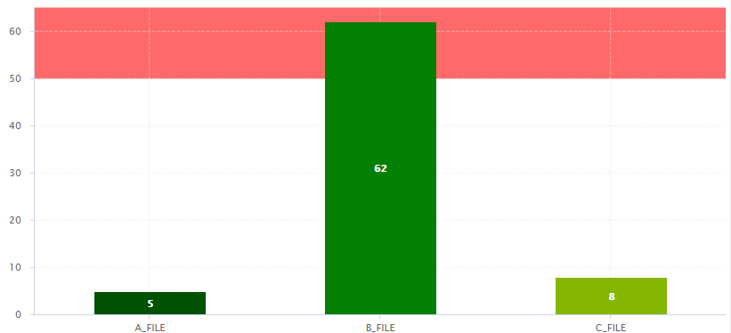
The evolution of an indicator within the levels of its associated scale, using markers to represent the different scale levels
<chart type="OptimizedBar" id="MARKERS_VERTICAL_EXAMPLE" asPercentage="false">
	<measure color="0,81,0">A_FILE</measure>
	<measure color="3,127,3">B_FILE</measure>
	<measure color="133,182,2">C_FILE</measure>
	<markers>
		<marker value="50" endValue="100" color="RED" alpha="150" isVertical="false" />
	</markers>
</chart>
There are five ways to include markers on a chart:
By using a scale ID to apply colouring to the entire background for all available scale levels. See the fromScale
attribute below.
By using an indicator ID to apply colouring to the entire background for all available scale levels associated to the indicator. See the fromIndicator
attribute below.
By specifying a metric to display its goal for each milestone in the project. See the fromMilestonesGoal
attribute below.
By requesting to display a marker for the dates of all milestones in the project. See the fromMilestones
attribute below.
By manually specifying the start and end values on the axes, and the colour of the marker you want. See the value
, endValue
and color
attributes below.
The marker
element has the following attributes:
fromScale
(optional, not compatible with value/endValue
) sets the scale to use to create a markers for each scale level using the
colour defined in the scale's properties.
fromIndicator
(optional) sets the indicator to use to retrieve a scale and create a markers for each scale level using the
colour defined in the scale's properties.
fromMilestonesGoal
(optional) draws markers for all of a metric's goals in the project. You can find an example in the section called “Milestone-Based Markers”.
fromMilestones
(optional) draws markers for all milestone dates in the project. You can find an example in the section called “Milestone-Based Markers”.
value
(optional, default: -infinity, cannot be combined with fromIndicator
, fromScale
,fromMilestonesGoal
, or fromMilestones
) sets the position on the axis to start drawing the marker from. You can specify an exact value, a percentage, or a compuration for this parameter.
endValue
(optional, default: infinity, cannot be combined with fromIndicator
, fromScale
,fromMilestonesGoal
, or fromMilestones
) sets the position on the axis to stop drawing the marker. You can specify an exact value, a percentage, or a compuration for this parameter.
isInterval
(optional, default: true, cannot be combined with fromIndicator
or
fromScale
) allows defining whether a marker covers an interval (true) or is simply a
line on the chart (false). When set to false, endValue
is ignored, and
the following extra parameters are available:
color
(optional, default: GREY, not compatible with fromIndicator
or fromScale
) is the colour code used to fill the marker region. [colour syntax]
alpha
(optional, default: 50) sets the opacity level (0 is transparent, 255 is fully
opaque).
isVertical
(optional, default: false)
specifies if the marker should be vertical (true) or horizontal
(false).
label
(optional, default: none) allows specifying a label for the marker.
labelColor
(optional, default: BLACK) allows specifying the color of the label text. [colour syntax]
labelFontSize
(optional, default: 9) defines the size of the label text.
labelFontStyle
(optional, default: PLAIN) defines the style of the label text. Supported values are:
PLAIN
BOLD
ITALIC
BOLD_ITALIC
labelAnchor
(optional, default: TOP_RIGHT if vertical, TOP_LEFT if horizontal)
defines the position of the label relative to the marker. The possible values are:
BOTTOM
BOTTOM_LEFT
BOTTOM_RIGHT
CENTER
LEFT
RIGHT
TOP
TOP_LEFT
TOP_RIGHT
labelTextAnchor
(optional, default: TOP_LEFT if vertical, BOTTOM_LEFT if horizontal)
defines the position of the text relative to the label. The possible values are:
BASELINE_CENTER
BASELINE_LEFT
BASELINE_RIGHT
BOTTOM_CENTER
BOTTOM_LEFT
BOTTOM_RIGHT
CENTER
CENTER_LEFT
CENTER_RIGHT
HALF_ASCENT_CENTER
HALF_ASCENT_LEFT
HALF_ASCENT_RIGHT
TOP_CENTER
TOP_LEFT
TOP_RIGHT