| Installation and Administration | Getting Started | Command Line | Configuration | Eclipse Plugin | Reference Manual |
| Show on single page Show on multiple pages |
|
|
|
|
Most charts use the measure
and indicator
elements to define
the metrics used in the chart. The attributes allowed for these element are:
label
(optional, default: the measure's name) defines or overrides the label used for the measure. Note that the chart thumbnail will always show the mnemonic no matter what the value of label
is.
color
(optional, default: the project's color, or a random color based on the artefact's name) defines the colour used to represent the measure in the chart. [colour syntax]
visible
(optional, default: true) allows including a measure on a chart as hidden. It will not be displayed by default, but can be added to the chart by clicking its name in the legend.
dataBounds
(optional, default: "];[") defines the range of values allowed to be displayed on the chart. You can use this attribute to exclude drawing an erroneous or non-representative value on a chart. This attribute is currently supported for the following charts: All Temporal Evolution charts, Quadrant, X/Y-Cloud, Histogram, Y-Cloud, Dial, Meter, Simple Pie and Optimised Pie.
[ and ] allow you to specify that a boundary value is included.
] and [ specify that the boundary value itself is excluded.
shape
(optional, default: CIRCLE) defines the shape used to represent a point on a chart. The allowed values are:
NONE
SQUARE
CIRCLE
DIAMOND
UP_TRIANGLE
DOWN_TRIANGLE
RIGHT_TRIANGLE
LEFT_TRIANGLE
HORIZONTAL_RECTANGLE
VERTICAL_RECTANGLE
HORIZONTAL_ELLIPSE
VERTICAL_ELLIPSE
stroke
(optional, default: SOLID) defines the type of line used join points. The allowed values are NONE, SOLID and DOTTED.
aggregationType
(optional, default: AVG in most charts, SUM in table charts) defines how the values for the
metrics on the chart are aggregated. The supported values are:
MIN
MAX
OCC
AVG
DEV
SUM
MED
MOD
weightMeasure
(optional, default: none) allows specifying how to weigh artefacts against each other in some charts (Simple Bar, Simple Pie and Simple Temporal Evolution Stacked Bar Chart). This is useful when you want to represent a percentage of artefacts in a chart but want the ratios to be based on a metric instead using the number of artefacts. Consider the example below where a chart shows child file artefacts and their rating the standard way (left), or weighted by lines of code per artefact (right, with weightMeasure="LC"):
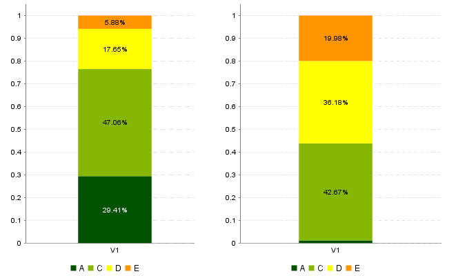
Child file artefacts and their rating the standard way (left), or weighted by lines of code per artefact (right)
Attributes that are specific to certain charts only are documented in each chart's section.