| > Show on single page > Show on multiple pages |
As a Squore administrator, you may need to keep track of the usage of the platform and report on its overall performance. This information is now available directly within Squore via Administration > Statistics. If you are also a model developer or a project manager and wish to fine-tune the layout of your dashboards, you will find more statistical data about how users consult analysis results via Models > Statistics and the Manage Project page. This section describes the information you can access from these pages. Note that statistics are collected locally, saved in the Squore database, and never sent anywhere. Statistics collection cannot be turned off. Viewing the statistics collected on the server is subject to licence.
Before you can view statistics on these pages, a date range must be selected in order to display information about the activity on the server during this period. You can also select whether the information is aggregated by day, week, month or year by adjusting the granularity setting, which can be overridden for individual charts later on.
The application usage statistics are broken down into five sections where you can view information about users, projects, hardware resources, pages response time and dashboard usage.
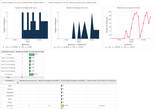
The Users tab displays the following information:
Global statistics about user accounts for this Squore Server installation
Information about Web Users and Command Line Users during the selected period
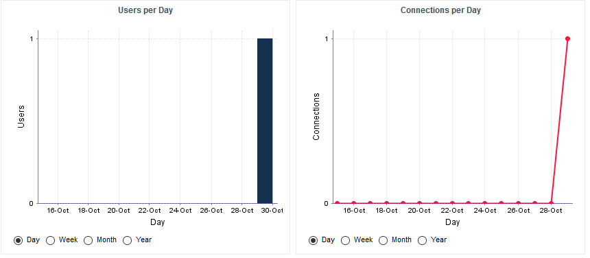
A series of charts containing information about the number of users, new users and overall connections to the server during the selected period
A table displaying session duration statistics
A table detailing session information per user
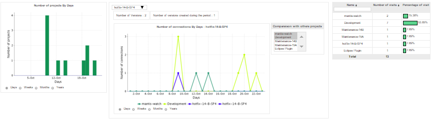
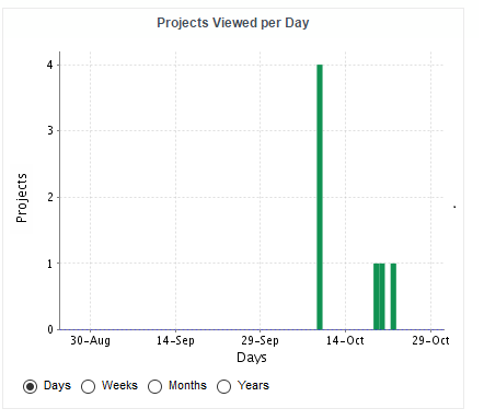
The Projects tab displays information about the number of projects viewed. You can get overall numbers of visits for all the projects on the server, or select specific projects to compare their number of views. The data is rendered as:
A chart showing a trend of the total number of projects for the selected reporting period
A chart where you can consult detailed view statistics about the projects of your choice. Select a project from the list to view viewing statistics, and overlay the same information for other projects by picking them from the list on the right hand side of the chart
Information about the number of sessions per project during the selected period
The Resources tab helps administrators in monitoring the memory and disk consumption and the performance of the application.
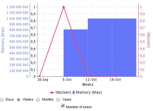
Memory Consumption vs. Number of Users: displays a history of the amount of memory used by the java process running the application. Optionally, a line indicating the number of users who logged in during this period can be displayed on the chart.
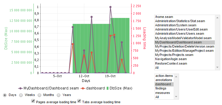
Database vs Average Load Time: displays a history of the size of the database on disk. Optionally, trend lines displaying the average page or tab load times can be displayed on the chart.
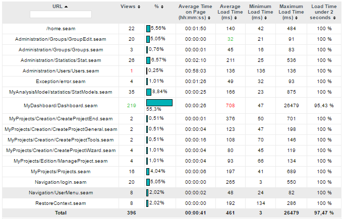
The Pages tab, shows statistics about page views and load times in tabular form and graphical form. The table automatically highlights the best result in green and the worst result in red.
You can learn more about the usage of particular features of a model by clicking Models > Statistics. For each analysis model, find out how many users consult results, which projects are the most popular and which regions and charts of the dashboard are the most useful for users.
The Users tab displays the information about the number of users and overall connections to the server for projects in this analysis model.
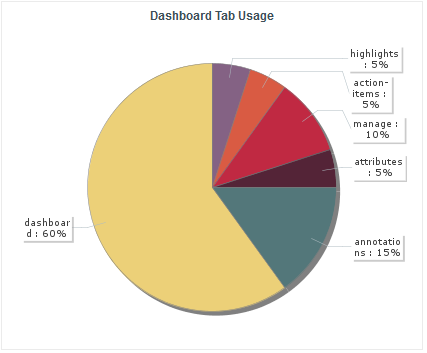
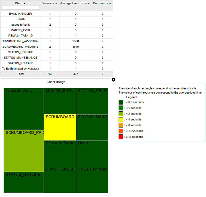
The Dashboard tab allows analysing the usage of each tab on the dashboard. Each tab is represented in a pie chart according to how many views it receives. This information can be used to adjust the default display status of each tab or their availability to end users.
As a project manager, you can use project statistics to investigate the popularity of your project by going to Manage > Statistics.
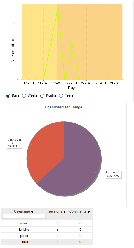
When you select a reporting period, the following information is displayed:
The trend of the number of views for this project uses the colours from the scale of the root indicator as background to help you correlate the project rating with the number of visits.
The pie chart helps you understand which of the dashboard tabs is the most visited for this project.
A table summarises the breakdown of views per user, as well as the number of comments left by each user.