| Installation and Administration | Getting Started | Command Line | Configuration | Eclipse Plugin | Reference Manual |
| Show on single page Show on multiple pages |
|
|
|
|
This specific dashboard displays information relative to all projects analysed with the current analysis model or group of project. It consists of a list of charts and a table with all the projects using this analysis model in this group and some chosen values (columns) to ease comparison between them.
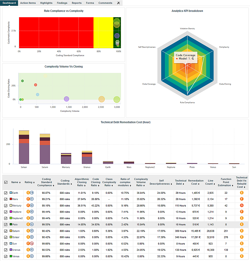
Analysis Model Dashboard
Its structure is as follows:
<dashboard type="MODEL" nbColumns="2" scoreGroups="true" indicatorId="PERFORMANCE" aggregationType="AVG" defaultWidthValue="500" defaultHeightValue="500">
	<charts>
	...
	</charts>
	<table id="PROJECT_SUMMARY" hideLastVersion="false" hideCreator="true" hideGroup="true" hideLevel="false">
	...
	</table>
</dashboard>
The dashboard
element supports the following attributes:
type
(mandatory)
is the type of artefact that this dashboard definition applies to.
nbColumns
(optional, default: 3)
sets the number of columns used to display the charts on the dashboard.
defaultWidthValue
(optional, default: 400)
sets the default width of a maximised chart if not specified within the chart itself.
defaultHeightValue
(optional, default: 400)
sets the default height of a maximised chart if not specified within the chart itself.
rowMaxHeight
(optional, default: 250)
define the maximum height in pixels of a row of charts on the dashboard.
template
(optional, default: 1x1 for all charts)
allows changing the aspect ratio of charts in the dashboard, using the syntax "position:width x height;".
Note that the use of this attribute requires defining a value for the nbColumns
attribute.
For more details about dashboard templates, refer to the section called “Dashboard Templates”.
minSizeForLegend
(optional, default: no legends on thumbnails)
allows displaying chart legends on the thumbnails for charts whose ratio is above the specified minimum. By default,
no chart legends are displayed on thumbnails. If you want to force the legend to be displayed on thumbnails, specify for what chart
ratio the thumbnail will be generated. Charts have a ratio of 1x1 by default, so specify minSizeForLegend="1x1" to force legends for all charts. If you want to display legends for all charts that have a width that is twice their height,
specify minSizeForLegend="2x1".
If a chart has an attribute legend="false", then its legend will not be included on the thumbnail even if its ratio matches the one specified in minSizeForLegend.
In order to tell Squore to rate groups of project, you can use the following attributes for
the dashboard
element:
scoreGroups
(optional, default: false) turns the rating display on or off for groups of projects. When rating groups is disabled, you can use a group icon instead by defining it in a properties file (G.<group_name>.ICON=path/to/icon.ico).
indicatorId
(optional, default: LEVEL) is the indicator to use to rate the project group when
scoreGroups
is set to true.
aggregationType
(optional, default: AVG) is the aggregation method used to compute the indicator level
when scoreGroups
is set to true. The supported values allowed are:
MIN
MAX
OCC
AVG
DEV
SUM
MED
MOD
The charts area allows displaying a series charts. Only the following charts are supported at this level: Quadrant, Kiviat, Temporal Evolution Chart, Dial, Meter, Treemap, SQALE Pyramid.
The table area shows information about the projects analysed with the current model. Projects that do not belong to the portfolio are not shown.
The first column allows to check or uncheck the projects whose information
should be used to compute data on the charts. The information can be aggregated in the charts
in several ways using the aggregationType
attribute of a
measure
or indicator
element. At model-level,
aggregating has the effect of showing one line per project for each metric defined in the chart.
You can find out more about this attribute in the section called “Common Attributes for measure and indicator
”.
Other columns, showing specific information about the project, are defined as follows:
<table id="PROJECT_SUMMARY" hideLastVersion="false" hideCreator="true" hideGroup="true" hideLevel="false">
	<column indicatorId="BUSINESS_VALUE" headerDisplayType="NAME" displayType="VALUE" "decimals="0" />
	<column indicatorId="QUALITY" headerDisplayType="NAME" displayType="VALUE" decimals="2" suffix="%"/>
	<column indicatorId="TECH_DEBT" headerDisplayType="NAME" displayType="VALUE" decimals="0" />
	<column indicatorId="TECH_DEBT_IDX" headerDisplayType="NAME" displayType="VALUE" decimals="2" suffix="/FUNC"/>
	<column indicatorId="SUMSLOC" headerDisplayType="NAME" displayType="VALUE" decimals="0" />
</table>
The
column
sub-element has the following attributes:
indicatorId
is the unique identifier of the measure, indicator or textual information to be displayed.
headerDisplayType
(at model-level)
or
displayType
(at artefact-level)
(optional, default: MNEMONIC)
defines how the indicator is shown in the interface. The supported values are:
NAME
MNEMONIC
DESCRIPTION
displayOnlyIf
(optional) allows specifying a computation to evaluate whether or not to show the chart in the dashboard. If
the result of the computation is more than 0, then the chart is displayed. Consult Chapter 5, Computation Syntax for
more information about the supported computation syntax. Note that computations used in
displayOnlyIf
have a limited scope: they only apply to the current node in its current version.
This means that the functions like PREVIOUS_VALUE(), PREVIOUS_INFO(), DELTA_VALUE(), APP(), ANCESTOR(), PARENT() or
IS_DP_OK() cannot be used with displayOnlyIf
.
displayedValue
(optional)
allows overriding the indicator to display another measure instead.
The attribute takes a measure Id (displayedValue="SLOC").
displayType
(at model-level) or
displayValueType
(at artefact-level)
(optional, default: VALUE)
defines how the indicator's value is shown in the interface. It
may be one of:
NAME the level's name
MNEMONIC the level's mnemonic
RANK the level's rank
VALUE the measure's value
ICON the level's icon
DATE the measure value converted to date format
DATETIME the measure value converted to datetime format
TIME the measure value converted to time format
TEXT when the metric you are trying to display is textual information, as described in the section called “Using Textual Information From Artefacts”
PERCENT to automatically convert a value between 0 and 1 into a percentage (also appending '%' as a suffix)
For DATE,DATETIME and TIME, you can specify the required format using the dateStyle, timeStyle and datePattern attributes described below.
unknownValue
(optional, default: "?")
defines what text
to display if the level of the indicator is UNKNOWN or outside the specified dataBounds
. Set this to OFF
to use the old behaviour (which display the rank -1).
emptyValue
(optional, default: "-")
defines what text
to display if there is no value in the database for the specified metric, or if a date is not specified.
This is usually useful if a date has not been set yet manually in a form (and is therefore equal to 0), or if you have just added a
new metric to your model you want to display specific text for the versions of your project where this metric did
not exist yet.
dataBounds
(optional, default:[;[)
allows overriding the normal range of values that would trigger the display of the
unknownValue
text. This allows you to display the unknown value if the metric
associated with the indicator is not within the defined bounds.
dateStyle
(optional, default: DEFAULT): the date formatting style,
used when the displayType is one of DATE or DATETIME.
timeStyle
(optional, default: DEFAULT): the time formatting style,
used when the displayType is one of DATETIME or TIME. See above for available styles.
datePattern (formerly dateFormat)
(optional, default: empty): the date pattern, used when
the displayType is one of DATE,
DATETIME or TIME.
If this attribute is set, both dateStyle and timeStyle attributes are ignored. The date is formatted using the supplied pattern. Any format compatible with the Java Simple Date Format can be used. Refer to http://docs.oracle.com/javase/6/docs/api/java/text/SimpleDateFormat.html for more information.
suffix
(optional, default: empty) is the label displayed after the value of the metric in the UI
decimals
(optional, default: 0) is the number of decimals places to be used for displaying values
roundingMode
(optional, default: HALF_EVEN)
defines the behaviour used for rounding the numerical values displayed. The supported values are:
CEILING to round towards positive infinity.
DOWN to round towards zero.
FLOOR to round towards negative infinity.
HALF_DOWN to round towards "nearest neighbour" unless both neighbours are equidistant, in which case round down.
HALF_EVEN to round towards the "nearest neighbour" unless both neighbours are equidistant, in which case, round towards the even neighbour.
HALF_UP to round towards "nearest neighbour" unless both neighbours are equidistant, in which case round up.
UP to round away from zero.
For more examples of rounding mode, consult http://docs.oracle.com/javase/6/docs/api/java/math/RoundingMode.html.