| Installation and Administration | Getting Started | Command Line | Configuration | Eclipse Plugin | Reference Manual |
| Show on single page Show on multiple pages |
|
|
|
|
The Artefact Table allows displaying a list of child artefacts and one or more of their characteristics in table format, as shown below:
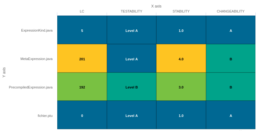
Artefact Table
<chart	type="ARTEFACTTABLE"
  id="ARTEFACT_TABLE_EXAMPLE"
  xLabel="X axis"
  yLabel="Y axis"
  onlyDirectChildren="true"
  targetArtefactTypes="FILE">
	<indicator>LC</indicator>
	<indicator displayValueType="NAME">TESTABILITY</indicator>
	<indicator displayValueType="RANK">STABILITY</indicator>
	<indicator displayValueType="MNEMONIC">CHANGEABILITY</indicator>
</chart>
In the example above, the indicators use different displayValueType
to show
all the supported values.
The Artefact Table
chart
element may have the following attributes:
targetArtefactTypes
allows to filter descendants according to their type. You can use one or more types.
Concrete and abstract types are supported, so it is possible to use an alias, as described in the section called “Artefact Types”.
onlyDirectChildren
(optional, default: false) includes artefacts that are direct children of the current artefact
when set to true, or all descendants of the current artefact when set to false.
orderByMeasure
(optional, alphabetical if omitted) allows sorting the list of artefacts according to the value of the specified measure ID.
inverted
(optional, default: false) allows reversing the sort order defined by the orderByMeasure
attribute.
The Artefact Table chart takes one or more
indicator
sub-elements, which can point to measures or indicators. Note that
the table cells are automatically coloured according to the corresponding scale level colour when the metric
displayed in the table is an indicator. This behaviour can be overridden by using the
colorFromScale
attribute, which takes a scale ID to apply colour from according to the
rank of the value displayed.
This chart also accepts a
filterMeasure
element, which allows refining which
artefacts are included on the chart. When drawing a chart, Squore checks if the metric specified is within the defined bounds for the artefact,
in order to know if it should be included in or excluded from the chart.
You can use the filterMeasure
(with a mandatory
dataBounds
attribute) as follows:
<chart id="CHART_ID" type="CHART_TYPE">
	<measure>METRIC_A</measure>
	<measure>METRIC_B</measure>
	<filterMeasure dataBounds="[50;100]">METRIC_C</filterMeasure>
</chart>
In the example above, the chart will include the artefact only if METRIC_C is between 50 and 100.
Filtering artefacts on charts is not possible at model-level.
In addition, you can add a row and column to aggregate the results found in each table row or column using the
row
or column
element. Each of these elements accepts the following
attributes:
aggregationType
(optional, default: AVG in most charts, SUM in table charts) defines how the values for the
metrics on the chart are aggregated. The supported values are:
MIN
MAX
OCC
AVG
DEV
SUM
MED
MOD
label
(mandatory)
is a string that is displayed as the legend of the row or column.
color
(optional, default: GREY)
is the fill colour for the row or column. [colour syntax]
colorFromScale
(optional, default: empty)
allows filling cells with a colour taken from a specific scale.
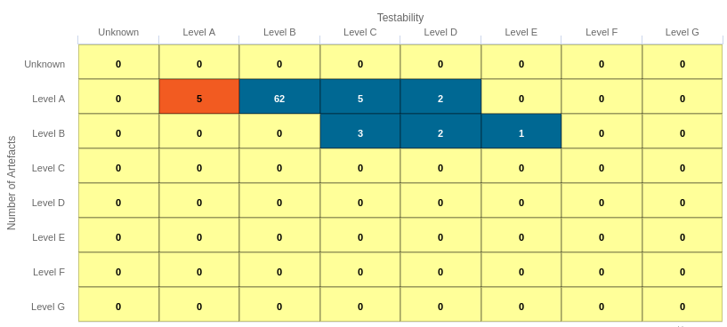
The Distribution Table is an matrix-like visualisation of two characteristics of an artefact's descendants
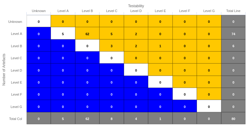
Distribution Table
<chart type="DISTRIBUTIONTABLE"
  id="DIST_TABLE_FIXED_COLOR_EXAMPLE"
  targetArtefactTypes="FILE"
  xLabel="Testability"
  yLabel="Number of Artefacts"
  topColor="ORANGE"
  bottomColor="BLUE">
	<indicator>ROOT</indicator>
	<indicator>TESTABILITY</indicator>
	<row aggregationType="SUM" label="Total Col" color="GRAY" />
	<column aggregationType="SUM" label="Total Line" color="GRAY" />
</chart>
The Distribution Table
chart
element may have the following attributes:
targetArtefactTypes
allows to filter descendants according to their type. You can use one or more types.
Concrete and abstract types are supported, so it is possible to use an alias, as described in the section called “Artefact Types”.
color
(optional, default: WHITE)
is the colour used to fill all the cells in the table. An example
Distribution Table using color
is shown later in this section. [colour syntax]
Instead of using a single colour for the entire table, you can use
topColor
, middleColor
and bottomColor
to colour the top, middle and
bottom sections of the chart respectively in different colours, as in the main example above. [colour syntax]
colorFromScale
(optional, default: none)
is the colour scale used to fill the cells in the table according to the rank of each cell. An example
Distribution Table using colorFromScale
is shown later in this section.
If several colour attributes are found, they are applied in this order:
The Distribution Table chart takes two
indicator
sub-element that will be used to build a matrix of scale levels.
In addition, you can add a row and column to aggregate the results found in each table row or column using the
row
or column
element. Each of these elements accepts the following
attributes:
aggregationType
(optional, default: AVG in most charts, SUM in table charts) defines how the values for the
metrics on the chart are aggregated. The supported values are:
MIN
MAX
OCC
AVG
DEV
SUM
MED
MOD
label
(mandatory)
is a string that is displayed as the legend of the row or column.
color
(optional, default: GREY)
is the fill colour for the row or column. [colour syntax]
colorFromScale
(optional, default: empty)
allows filling cells with a colour taken from a specific scale.
Some simpler examples of Distribution Table charts can be found below:
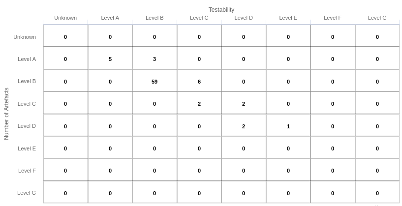
Simple Distribution Table
<chart type="DISTRIBUTIONTABLE"
  id="DIST_TABLE_EXAMPLE"
  targetArtefactTypes="FILE"
  xLabel="Testability"
  yLabel="Number of Artefacts">
	<indicator>ROOT</indicator>
	<indicator>ANALYSABILITY</indicator>
</chart>
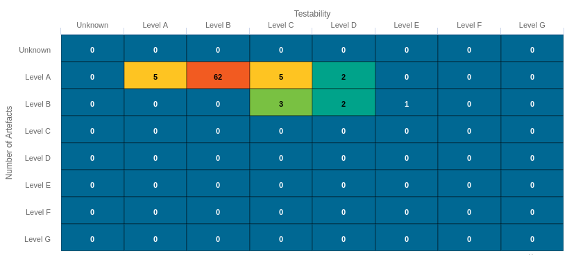
Distribution Table with cells coloured according to a scale
Chart:
<chart type="DISTRIBUTIONTABLE"
id="DIST_TABLE_SCALE_COLOR_EXAMPLE"
targetArtefactTypes="FILE"
xLabel="Testability"
yLabel="Number of Artefacts"
colorFromScale="SCALE_TEST_BASIC">
	<indicator>ROOT</indicator>
	<indicator>TESTABILITY</indicator>
</chart>


Scale:
<Scale scaleId="SCALE_TEST_BASIC">
  <ScaleLevel levelId="LEVELA" bounds="];1]" rank="1" />
  <ScaleLevel levelId="LEVELB" bounds="]1;2]" rank="2" />
  <ScaleLevel levelId="LEVELC" bounds="]2;4]" rank="3" />
  <ScaleLevel levelId="LEVELD" bounds="]4;8]" rank="4" />
  <ScaleLevel levelId="LEVELE" bounds="]8;16]" rank="5" />
  <ScaleLevel levelId="LEVELF" bounds="]16;32]" rank="6" />
  <ScaleLevel levelId="LEVELG" bounds="]32;[" rank="7" />
</Scale>
Simple Distribution Table with red/green
Chart:
<chart type="DISTRIBUTIONTABLE"
  id="DIST_TABLE_SCALE_COLOR_TWO_COLORS_EXAMPLE"
  targetArtefactTypes="FILE"
  xLabel="Testability"
  yLabel="Number of Artefacts"
  topColorFromScale="SCALE_GREEN"
  middleColorFromScale="SCALE_RED"
  bottomColorFromScale="SCALE_RED">
	<indicator>ROOT</indicator>
	<indicator>TESTABILITY</indicator>
</chart>


Scales:

<Scale scaleId="SCALE_GREEN">
  <ScaleLevel levelId="BLANK" bounds="];1[" rank="-1" />
  <ScaleLevel levelId="LEVELA" bounds="[1;[" rank="1" />
</Scale>

<Scale scaleId="SCALE_RED">
  <ScaleLevel levelId="BLANK" bounds="];1[" rank="-1" />
  <ScaleLevel levelId="LEVELG" bounds="[1;[" rank="1" />
</Scale>
The Cell Artefact Table (new in 17.1) offers a tabular representation of descendent artefacts of a certain type with added grouping and filtering possibilities compared to other table charts.
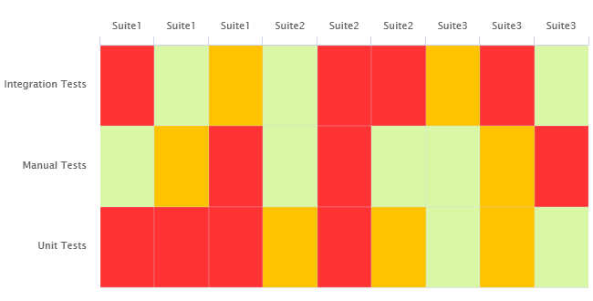
Cell Artefact Table
<chart	type="CellArtefactTable"
  id="CELLARTEFACTTABLE_EXAMPLE"
  targetArtefactTypes="SUITE"
  colorFromIndicator="ROOT"
  orderByMeasure="RUN_DATE"
  enabledAxisLabels="true"
  insideAxisLabels="false"
  artefactNameAsColumn="true">
    <groups>
        <group type="LINE" ancestorLevel="2" orderBy="NAME" />
    </groups>
</chart>
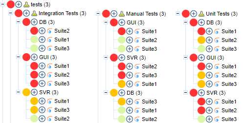
The test tree represented in the example chart shows each test suite as a cell, grouped on the same line by ancestor level -2 (the type of testing activity).
The chart
tag accepts the following attributes:
targetArtefactTypes
allows to filter descendants according to their type.
You can use one or more types. Concrete and abstract types are supported, so it is possible to use an alias,
as described in the section called “Artefact Types”.
For Stacked Bar Chart, Simple Temporal Evolution Stacked Bar Chart, Simple Pie, Simple Bar and Distribution Table, the measure and scale associated to the indicator must be the same for all types
colorFromIndicator
(optional, default: none) uses the specified indicator's colour scale to assign a colour to each item drawn on the chart.
orderByMeasure
(optional, alphabetical if omitted) allows sorting the list of artefacts according to the value of the specified measure ID.
enabledAxisLabels
(optional, default: true) allows showing (true) or hiding (false) axis labels
insideAxisLabels
(optional, default: false) allows printing the axis labels to the right of the y-axis (true) instead of to the left (false)
artefactNameAsColumn
(optional, default: false) allows printing the artefact names inside the cells (false) or at the top of each column (true)
Grouping can be achieved via a group
element defining an ancestorLevel
:
<groups>
	<group type="COLUMNS" ancestorLevel="1" />
	<group type="LINE" ancestorLevel="2" orderBy="NAME" />
	<group type="LINES" ancestorLevel="1" orderBy="NAME" />
</groups>
You can also filter which artefacts are to be displayed as cells checking a condition on their ancestors.
Include tests suites in the chart only if they are under a critical tested component:
<ancestors>
	<where artefactTypes="TEST_COMPONENT" measureId="IS_CRITICAL" value="1" />
</ancestors>
Include test suites in the chart only if they are linked to a library of ASIL level 2 or more
<ancestors>
	<where artefactTypes="LIBRARY" measureId="ASIL_LEVEL" bounds="[2;[" />
</ancestors>
This chart also accepts a
filterMeasure
element, which allows refining which
artefacts are included on the chart. When drawing a chart, Squore checks if the metric specified is within the defined bounds for the artefact,
in order to know if it should be included in or excluded from the chart.
You can use the filterMeasure
(with a mandatory
dataBounds
attribute) as follows:
<chart id="CHART_ID" type="CHART_TYPE">
	<measure>METRIC_A</measure>
	<measure>METRIC_B</measure>
	<filterMeasure dataBounds="[50;100]">METRIC_C</filterMeasure>
</chart>
In the example above, the chart will include the artefact only if METRIC_C is between 50 and 100.
Filtering artefacts on charts is not possible at model-level.